Justin Cox
Senior UX Designer
BreakoutEDU
An EdTech platform with over 2 million users
User Research | Information Architecture | Interaction Design | Usability Testing | Visual Design | Branding
About BreakoutEDU
Founded in 2015, BreakoutEDU is an EdTech startup that provides educational games and activities to k-12 students around the U.S. Breakout’s products have been used by over 500,000 teachers and more than 10 million students.
The Problem
BreakoutEDU faced a significant problem when the COVID-19 pandemic forced a transition from traditional classroom environments to remote learning. As students were no longer physically present in the classroom, BreakoutEDU recognized the need to adapt their educational games to an online platform.
Breakout had previously found success by providing physical games that were played in the classroom, so little focus had been placed on the digital platform. At the start of the pandemic, about 80% of Breakout’s customers were using physical products, while only 20% were using the digital platform. This was due in part to the lack of promotion for the platform, but also because the UI was clunky and difficult to navigate.
This case study explores the collaborative efforts undertaken to boost the performance of BreakoutEDU’s online platform, ensuring continued educational engagement for K-12 students during these unprecedented times.
Key Challenges
- Adapting the interactive and immersive elements of their games to a digital platform
- Ensuring high performance and scalability of the online platform to accommodate increased user demand
- Maintaining the educational value and engagement of the games in a virtual setting
- Making it easy enough for kindergarteners to use

Getting Started - Discovery
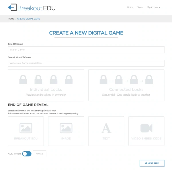
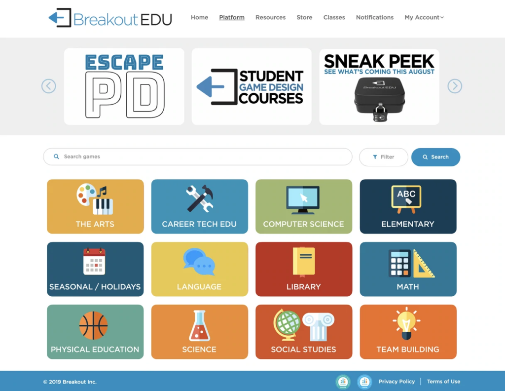
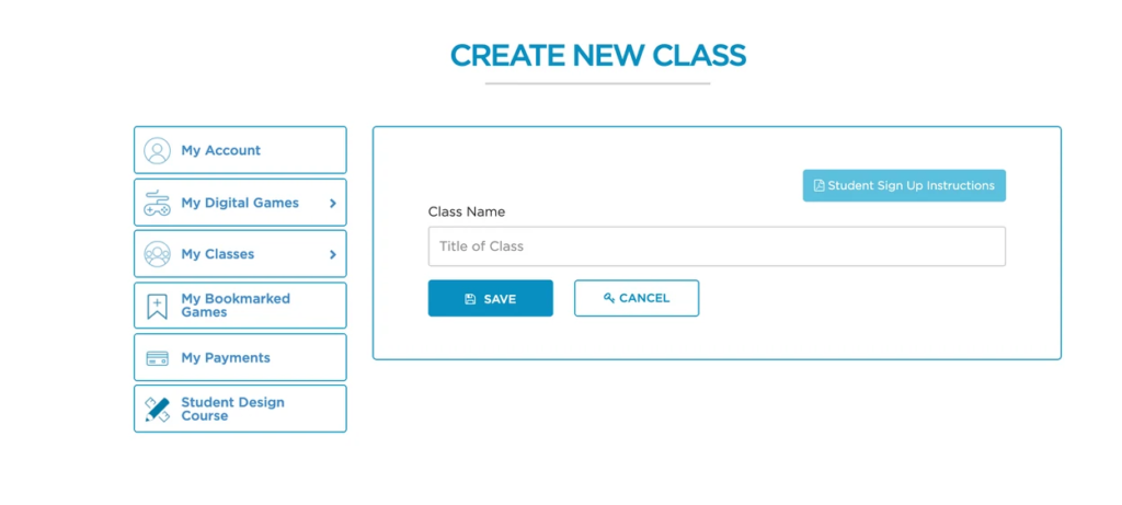
My first priority was to evaluate Breakout’s current digital product and understand what needed to be changed. It was clear from the beginning that their visual identity was not connecting with their audience as well as it could. Their product needed to appeal to elementary school students and teachers, but the logo and color scheme was dull and outdated. Their product was clinical, clunky, and confusing. It was un-intuitive and difficult to navigate.
Breakout's old branding and platform

Branding
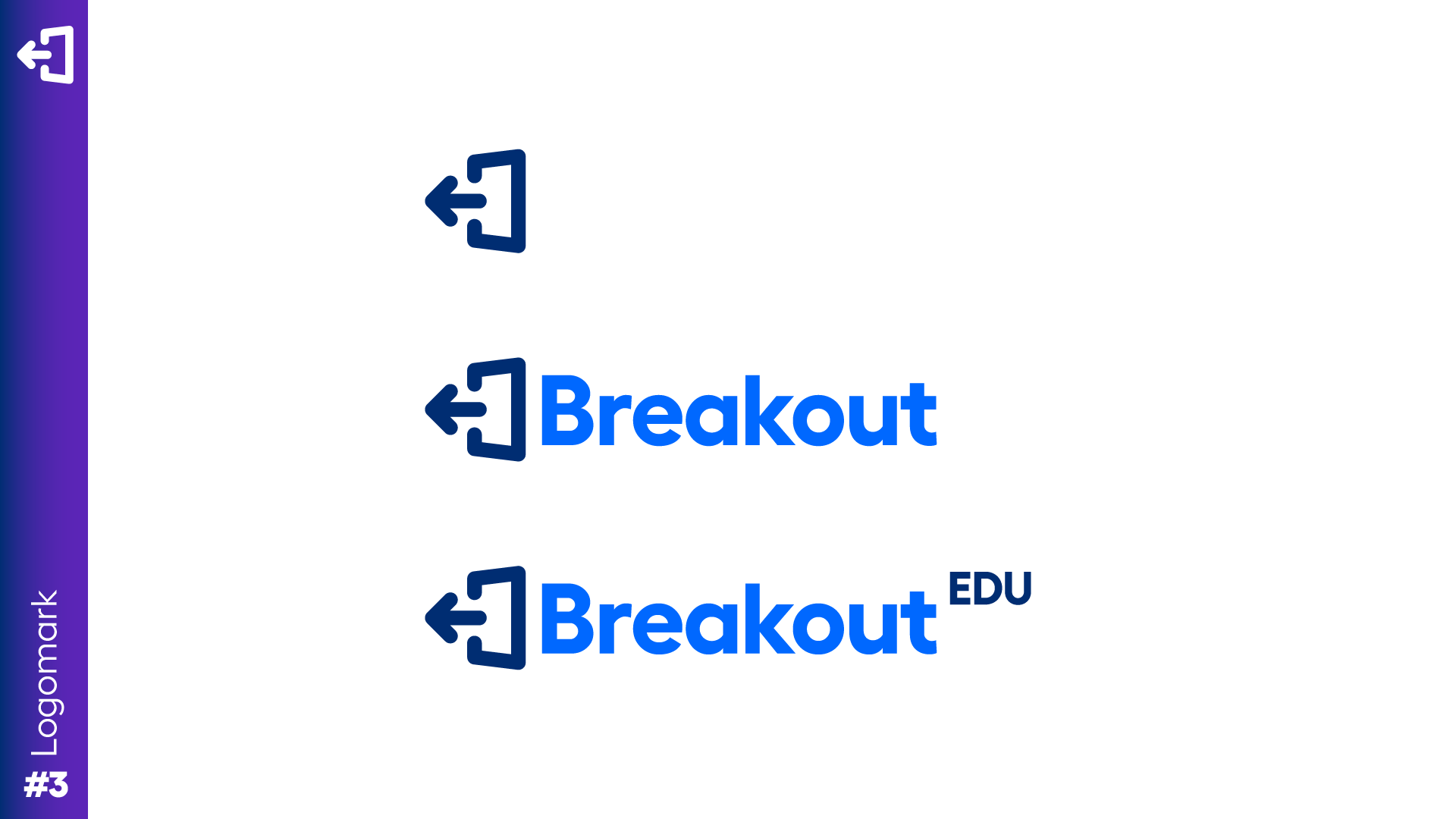
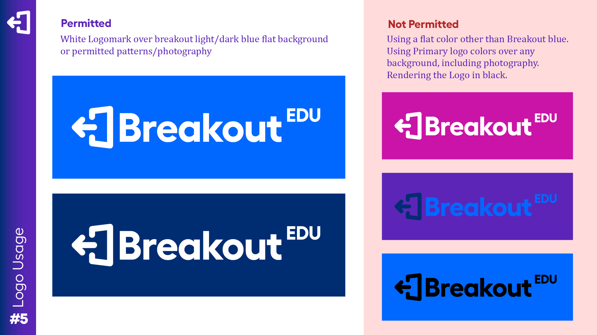
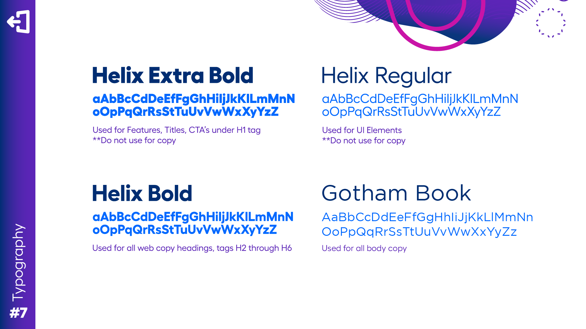
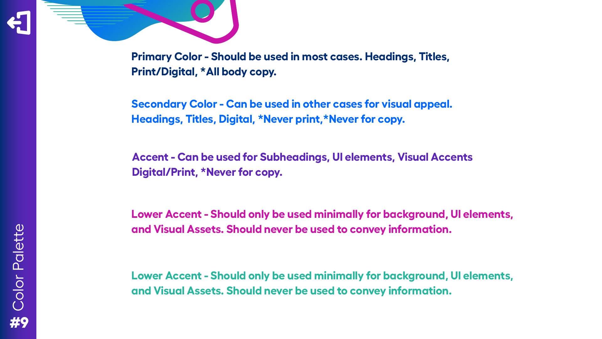
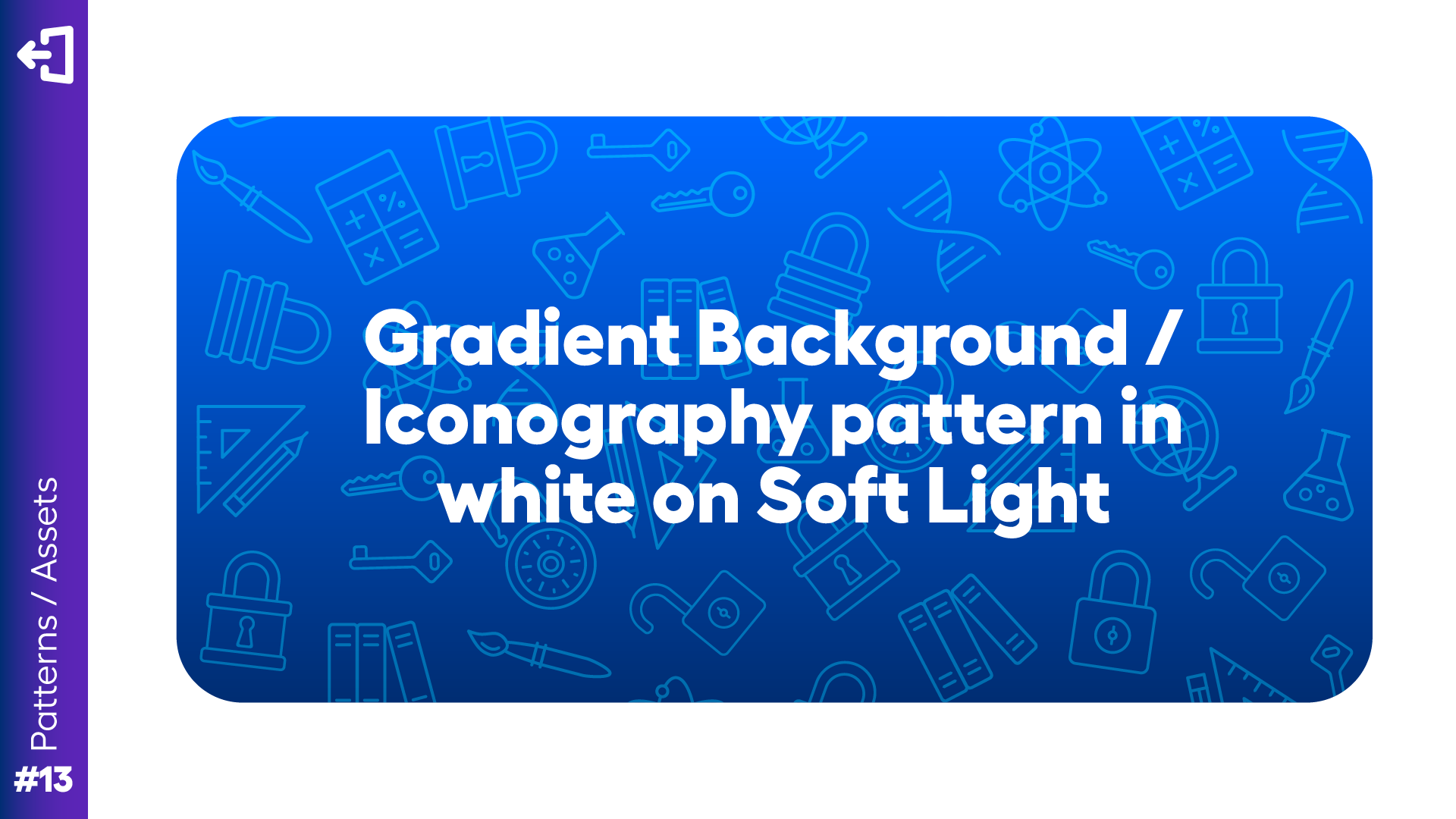
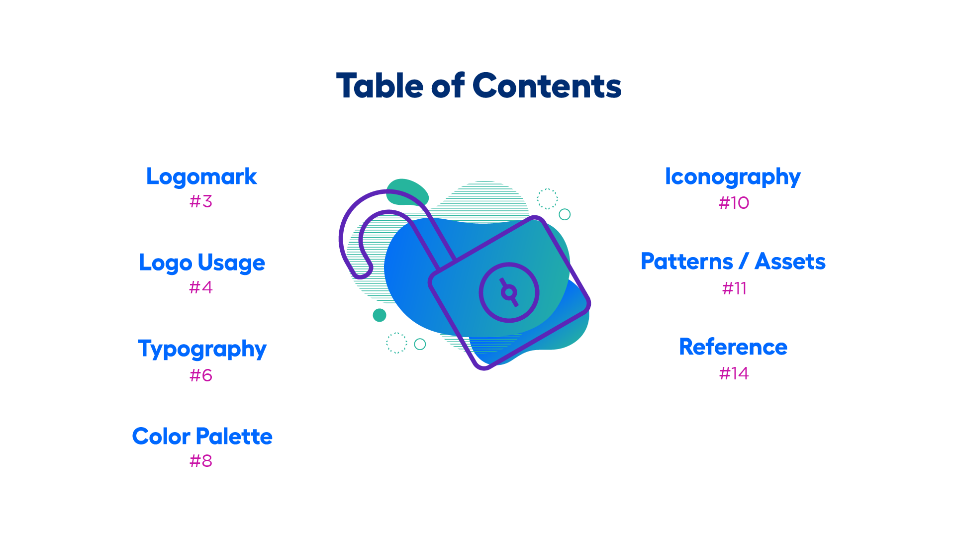
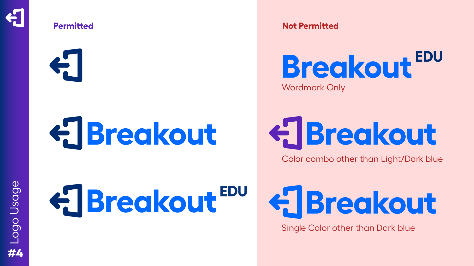
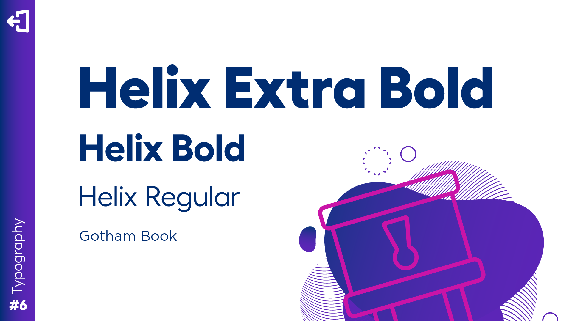
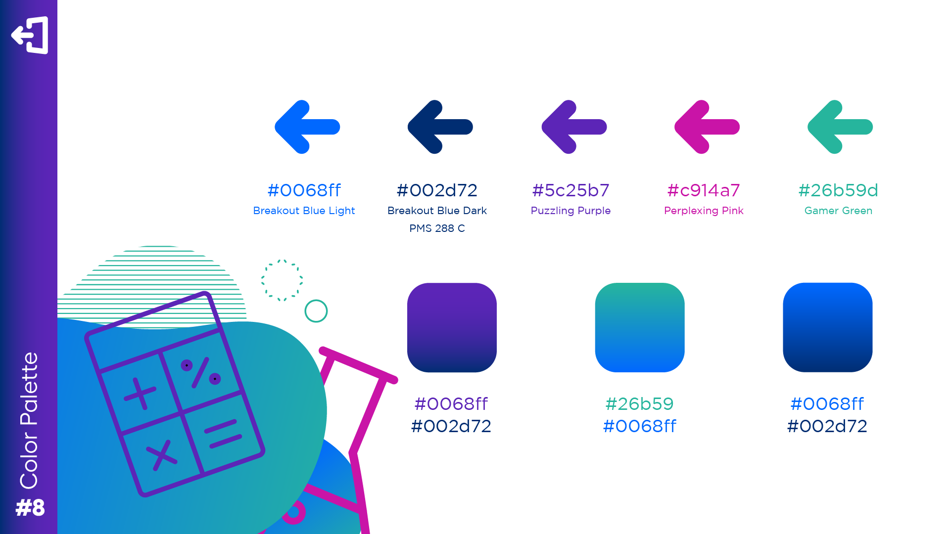
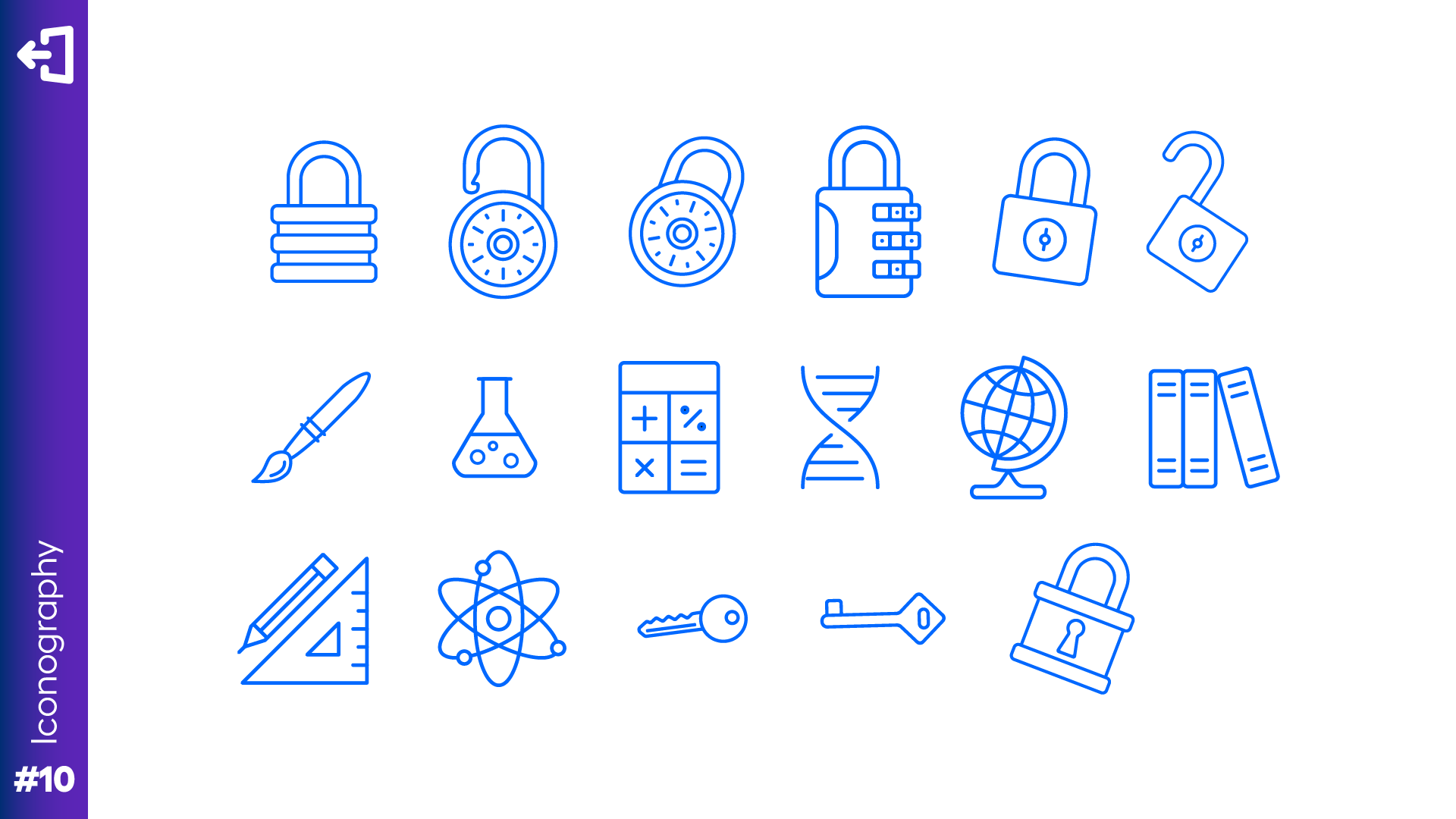
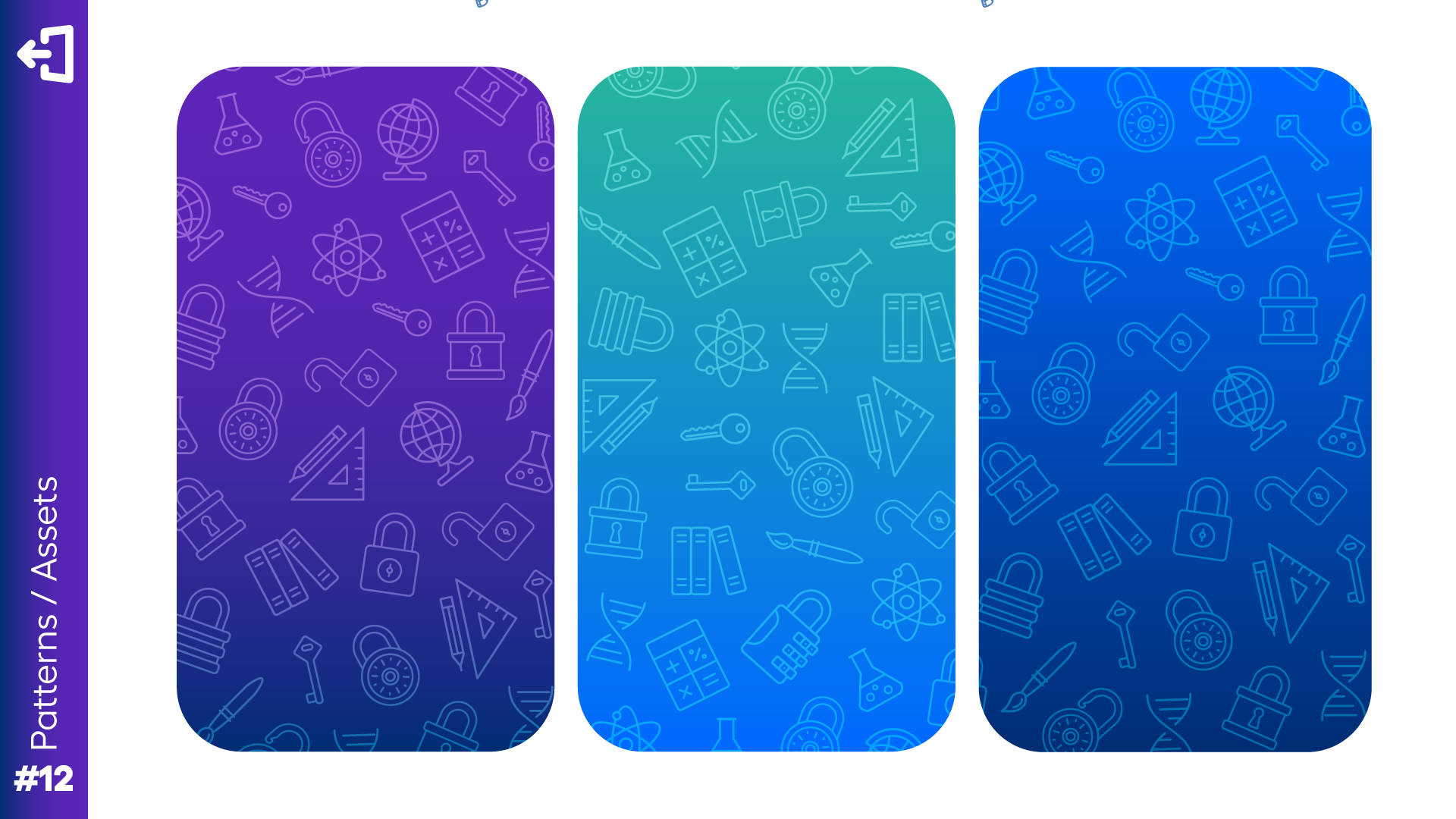
It was important to the team that the pictorial mark remain somewhat unchanged, as it was already recognizable to their customers. It was also important that the new identity delivered on the brand’s strategy. It needed to be fun and playful for children; It needed to be feminine due to the high ratio of female teachers; And lasty, it still needed to be corporate enough to appeal to school admins. Knowing this, I was able to prepare the following branding guide, which would become Breakout’s new visual identity.



UI Structure/Navigation
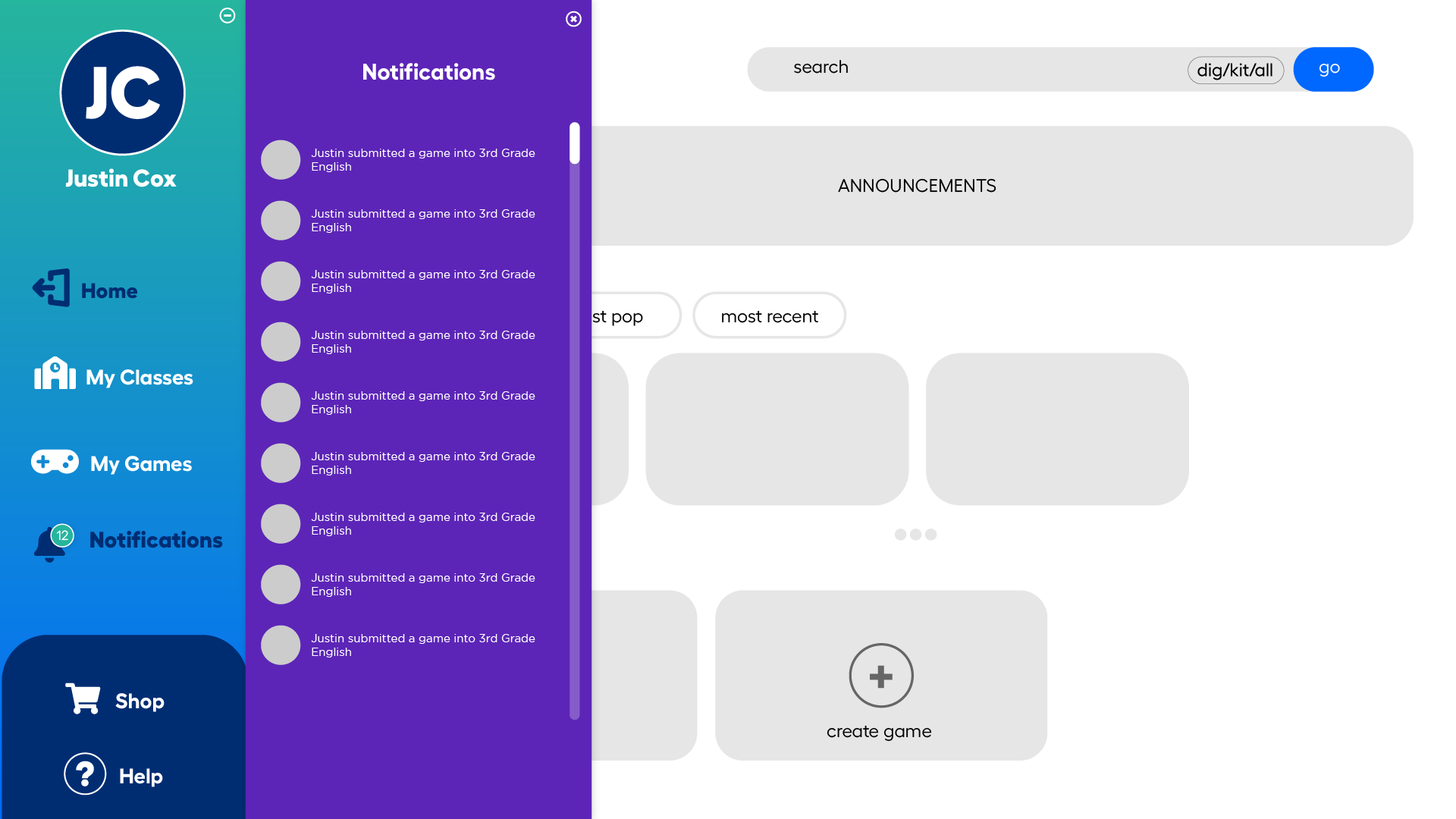
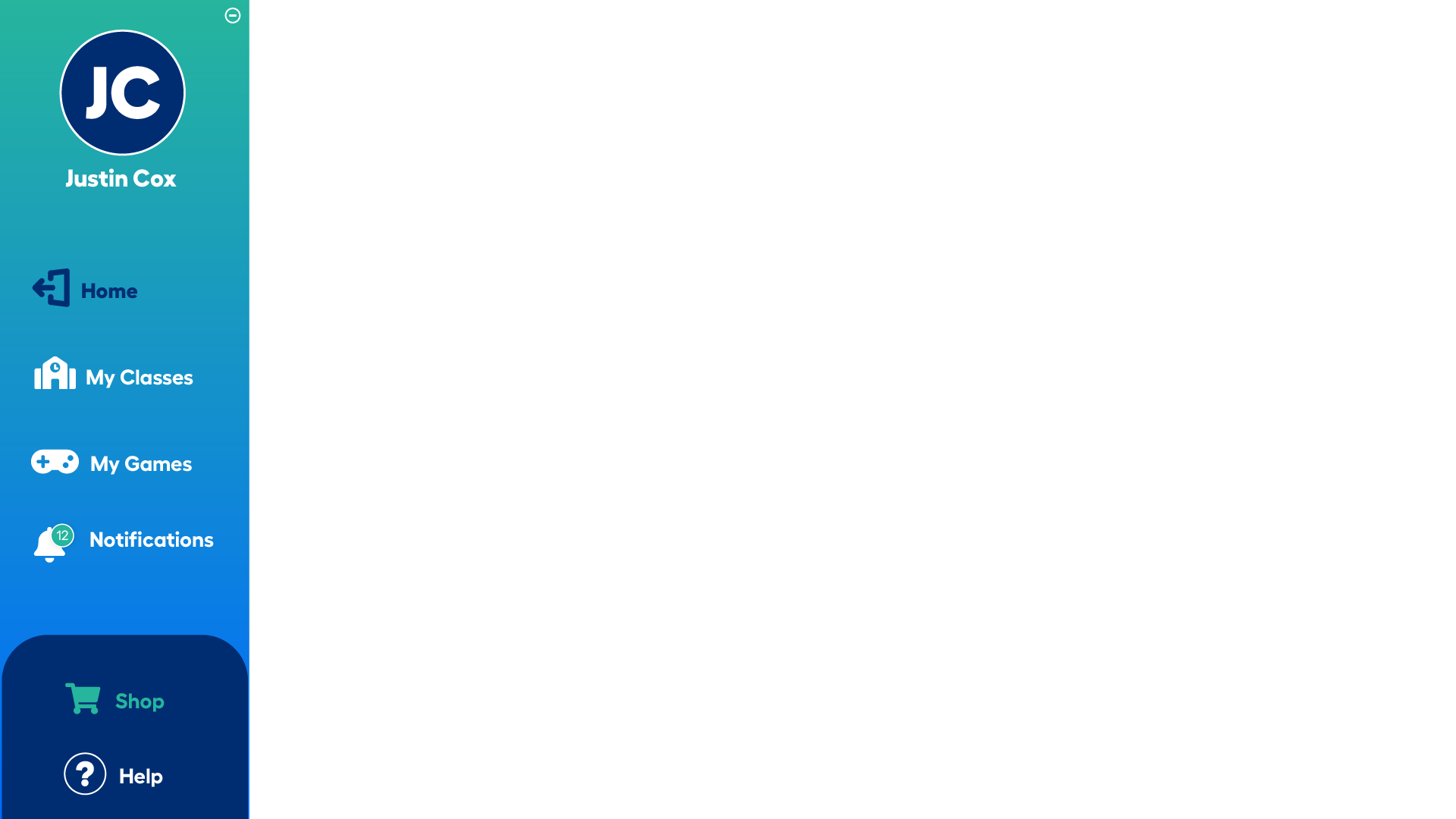
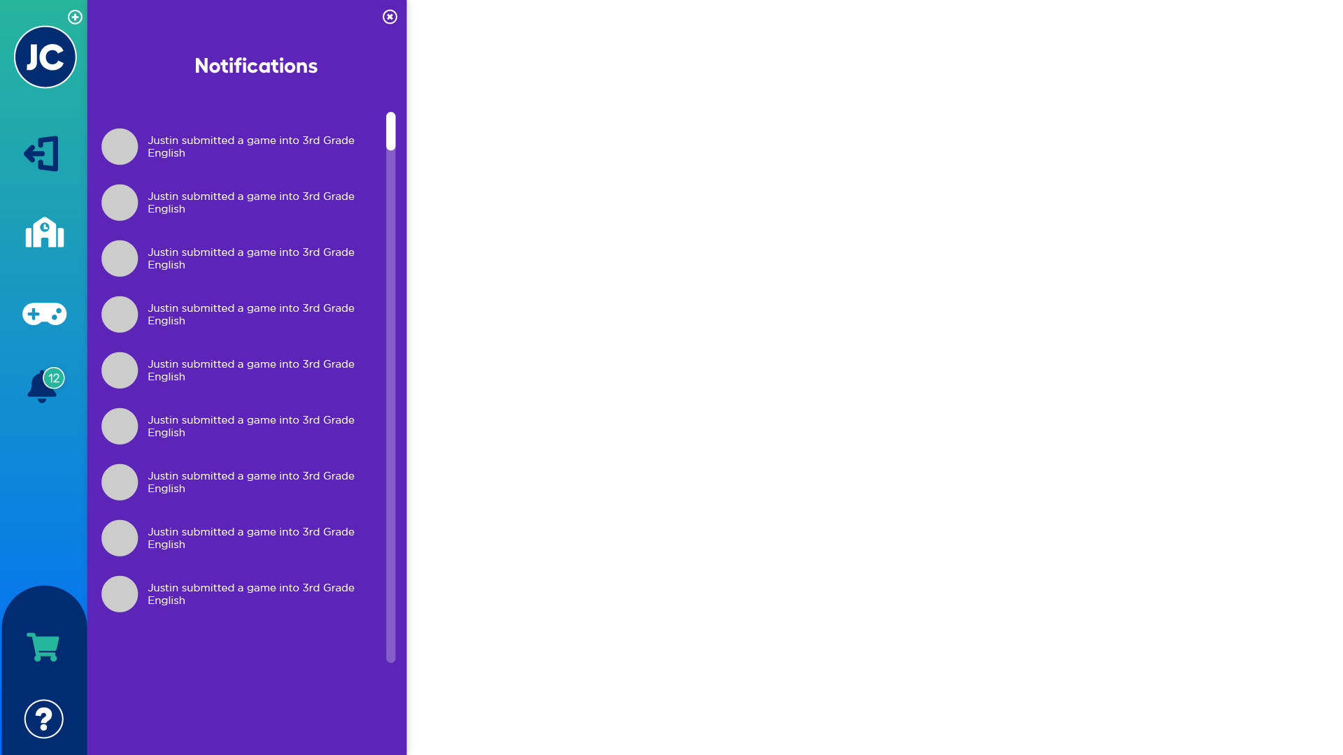
Breakout’s platform has two sides: One for teachers and one for students. It was important that they provided different experiences, but they needed to feel unified. After some deliberation, I settled on using a left-side rail navigation instead of a traditional header. This was to make the product feel more like an application and provide further unity between the two sides, while also standing out from competitors.



Teacher UI
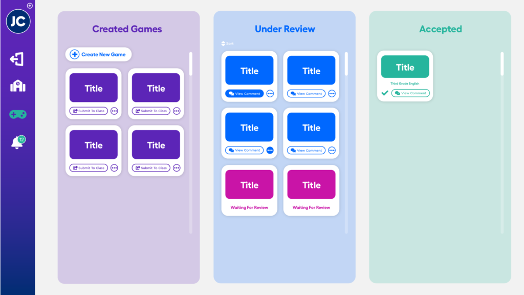
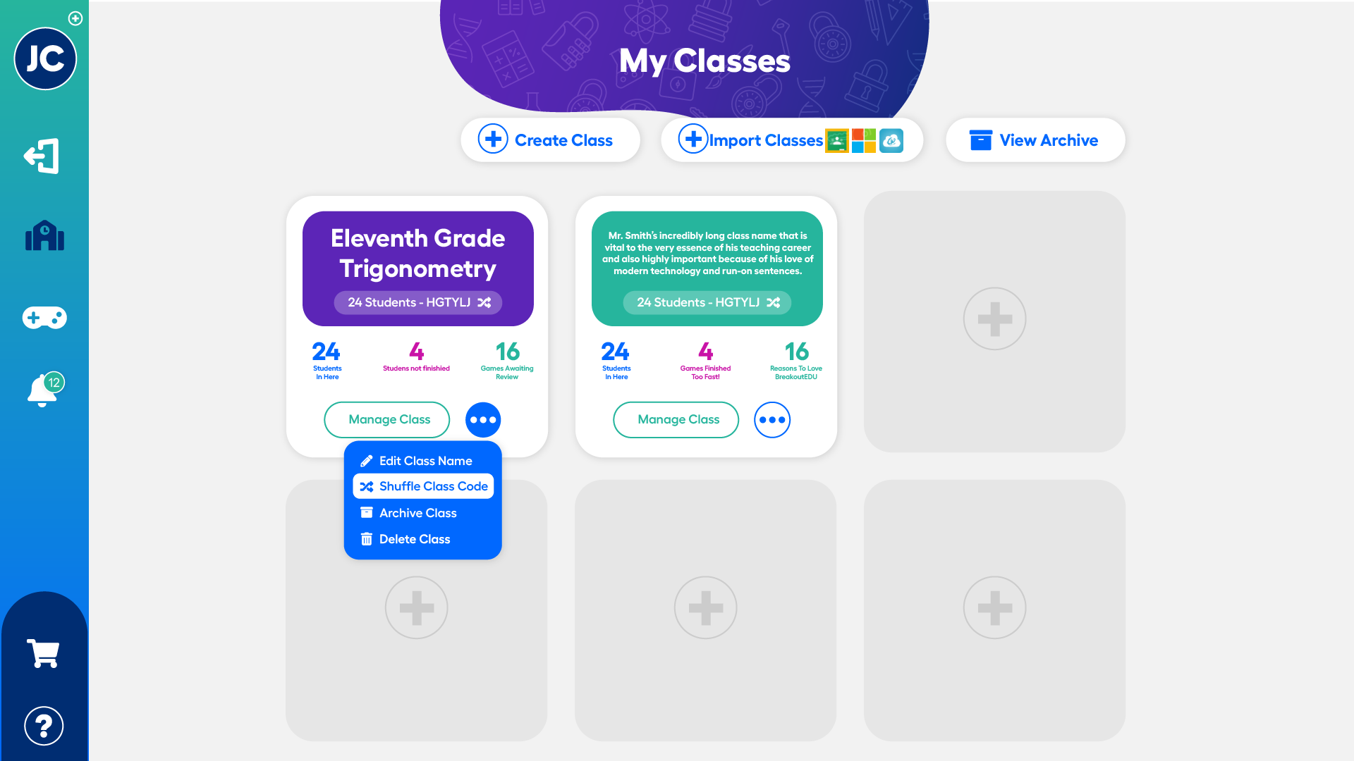
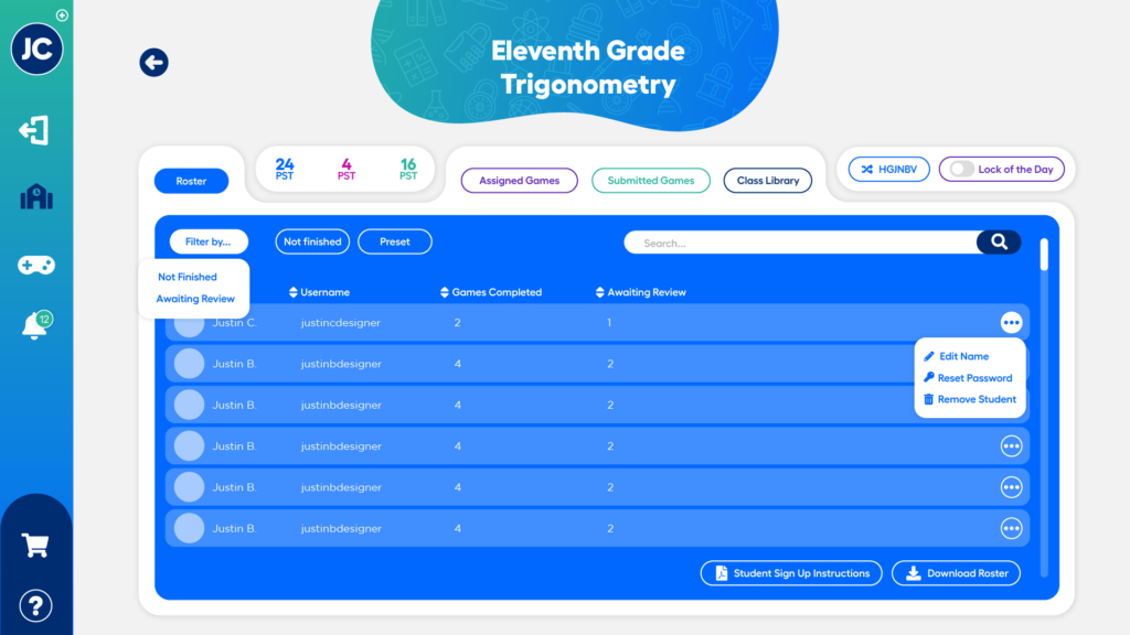
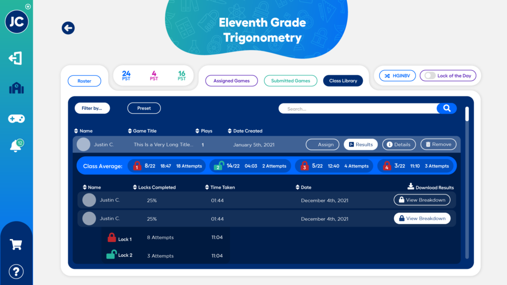
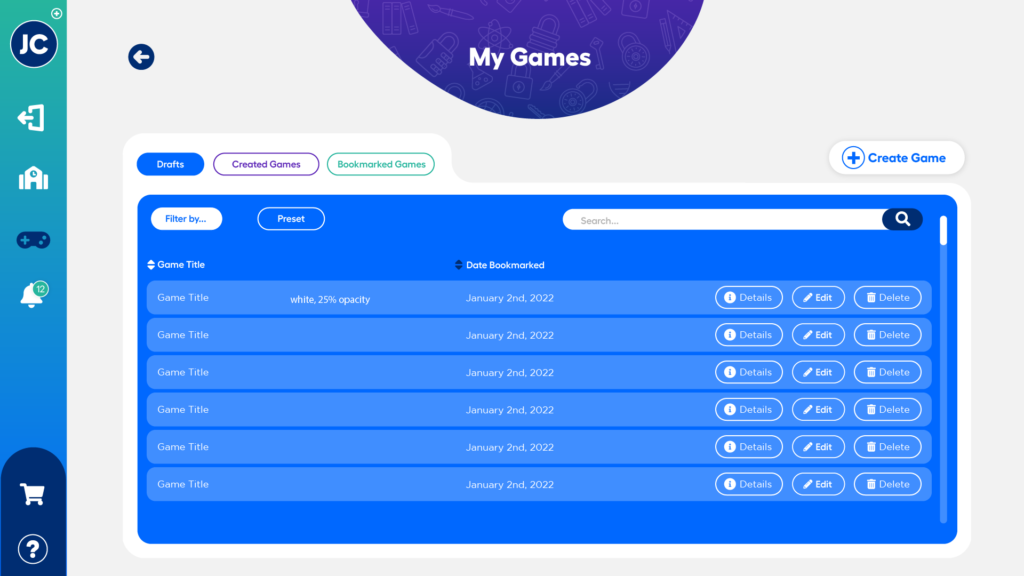
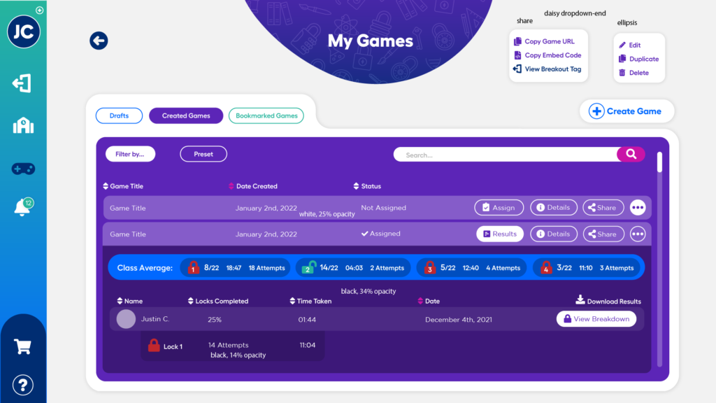
Breakout’s teacher tools were complicated and difficult to use, so my next priority was to re-design them with simpler user flows and new value-add features. One of the key methods I employed here was to breakdown what was previously multiple pages of information and reformat that into cards and tables that could display all necessary information without the need for a page refresh. This provides a much more streamlined experience for the user. I also used a card-based drag-and-drop system to improve touch interaction on tablets and create a design language that will be easy to use for kindergarten students on the student side of the platform.

Student UI
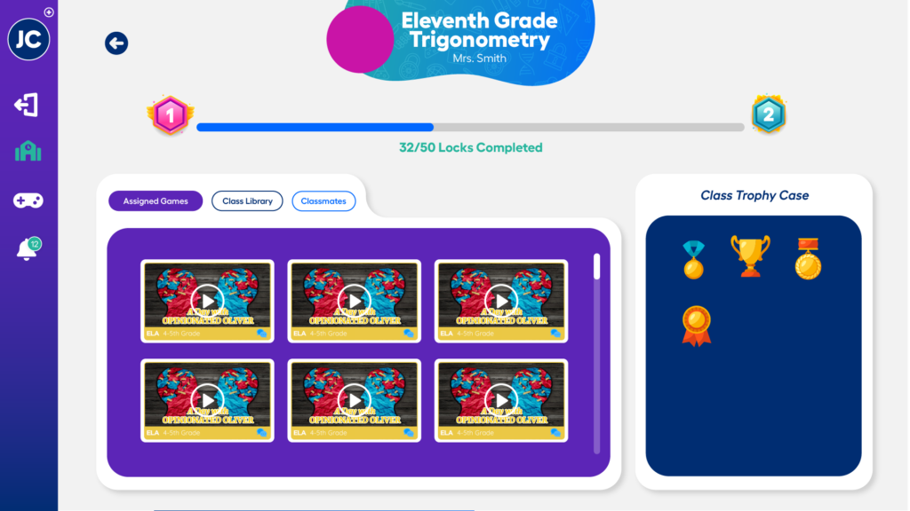
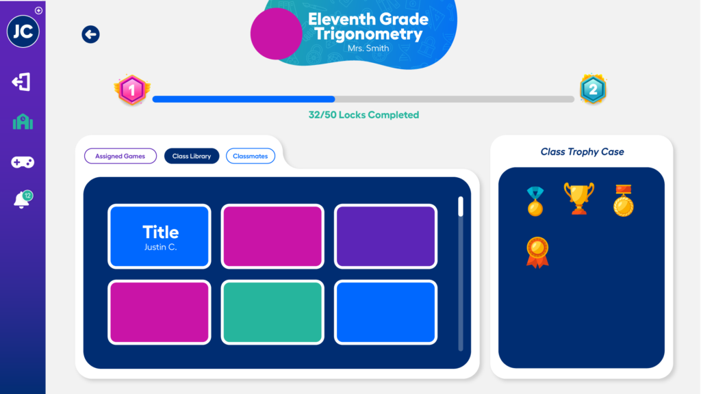
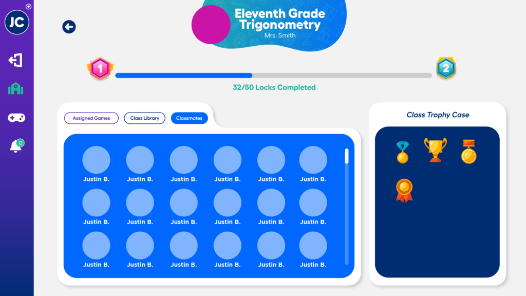
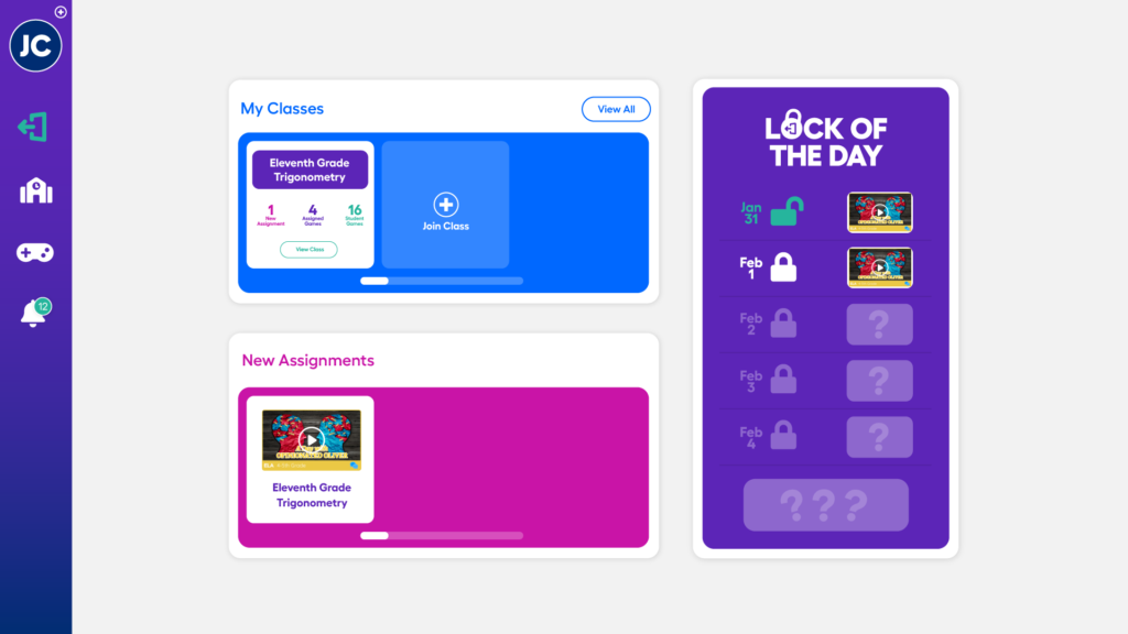
Breakout’s student experience was lacking features. The next step was to redesign the existing experience, while also creating exciting new features for students to enjoy, such as gamification elements and custom avatars.

