Case study · BreakoutEDU
Designing for trust when the classroom disappeared.
BreakoutEDU brought escape-room learning into classrooms. When in-person learning went away, the platform had to take over everything the room used to provide.
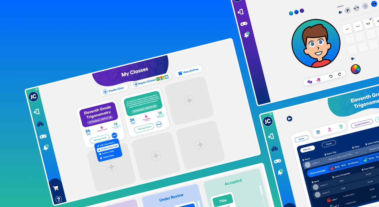
- Reach
- 500K+ educators using the platform
- Audiences
- 3 audiences held in one system: students, teachers, administrators
- Scope
- 2 redesigns delivered in parallel: the brand and the platform
What BreakoutEDU is
BreakoutEDU is an edtech platform used by more than 500,000 educators. It brings educational escape-game experiences into classrooms: students work together to solve puzzles, think critically, and collaborate, while teachers guide learning and celebrate progress.
The platform was built around in-person experiences. It supported the classroom rather than replacing it, and when in-person learning disappeared, it had to lead instead.
The redesign had to serve three people at once:
- Students
- needed to know where they were, what to do next, and whether they were progressing, with no one nearby to ask.
- Teachers
- needed situational awareness of a whole room without navigating away from the lesson they were teaching.
- Administrators
- needed the platform to behave the same way in every classroom, across schools with very different technical maturity.
- The brand
- had to hold up on screen under live classroom pressure, which is not what it was originally drawn for.
None of that structure came from the feature list. It came from what the problem turned out to be.
The classroom used to absorb confusion. Online, that safety net was gone
BreakoutEDU had relied on the classroom to resolve friction. Teachers clarified confusion, peers shared momentum, and the product worked quietly in the background. In a fully digital environment, the system itself had to provide that structure, for every person in the room.
Three pressures met in the same place, and none of them could be solved by adding features:
- Students
- compounded confusion quickly without teachers to clarify or peers to share momentum. They didn't know what to do next and had no one nearby to ask.
- Teachers
- were managing instruction and a platform at the same time, so every extra interaction was a tradeoff. Visibility into student progress was slow, incomplete, and pulled them away from the lesson.
- Administrators
- were rolling out across classrooms with varying technical maturity, which required something consistent and dependable enough to trust at scale.
The issue wasn't simply usability. The system failed to create confidence under independence.
That set the product goal, and it set the bar for everything after it: a self-guided experience where students could always understand where they were, what to do next, and whether they were progressing, without external support.
Lead Product Designer on a complex, multi-stakeholder platform
I led design across the full product experience, working closely with engineering leads, product management, and curriculum stakeholders, each with a different definition of success, from classroom usability to curriculum integrity to technical feasibility.
The work required continuous alignment so decisions held up both in real classrooms and at scale across districts. In practice the role wasn't just designing interfaces. It was creating shared clarity around what "independent learning" needed to mean inside the product, and holding that clarity across three very different audiences.
The challenge extended past designing screens. Students would ultimately be working alone with decisions the system made on their behalf, so every workflow had to balance guidance against freedom. Success depended on building enough shared understanding across product, engineering, and curriculum that independence could feel achievable rather than abandoning.
One sentence in a usability session reframed the entire project
“I'm not sure if I'm doing this right, but there's no one here to ask.” Student navigating independently, early usability session
We had been measuring success through task completion, and by that measure the product was fine. Students were finishing what we asked them to finish.
The real problem was uncertainty tolerance under independence. Students weren't struggling to complete actions. They were struggling with confidence in what came next. That distinction shifted everything, because a metric that says a task was completed says nothing about whether the person completing it believed they were doing it right.
The opportunity wasn't a better interface. It was making independent completion feel achievable, which is a different thing from making it possible.
Each of our methods had to be rebuilt around the new question:
| Before | After |
|---|---|
| Journey mapping tracked task flows | Journey mapping charted confidence-breakdown points across the full experience |
| Usability testing measured task completion | Usability testing measured whether users felt confident continuing without guidance |
| Prototyping was a design artifact | Prototyping became an alignment tool for judging how much ambiguity the system could safely allow |
Every interaction should either reduce uncertainty or reinforce momentum
Rather than treating students, teachers, and administrators as separate audiences with separate products, the system was designed as one connected experience that shifted by role and context.
Three principles held it together:
-
Continuity across roles. One connected system, not fragmented tools with different logic models. Each role should feel like they belong to the same experience.
-
Unmistakable progress. Immediate clarity on status, completion, and next steps, without interpretation, guesswork, or waiting for someone to confirm it.
-
Trust through predictability. Consistent, reliable behavior even under live classroom pressure, so students and teachers could focus on learning, not the platform.
Those three are what turn a tool into a system a student can be left alone with. A student who can answer where they are, what's next, and whether they're done doesn't need a teacher standing behind them.
Three layers, each reducing uncertainty at a different level
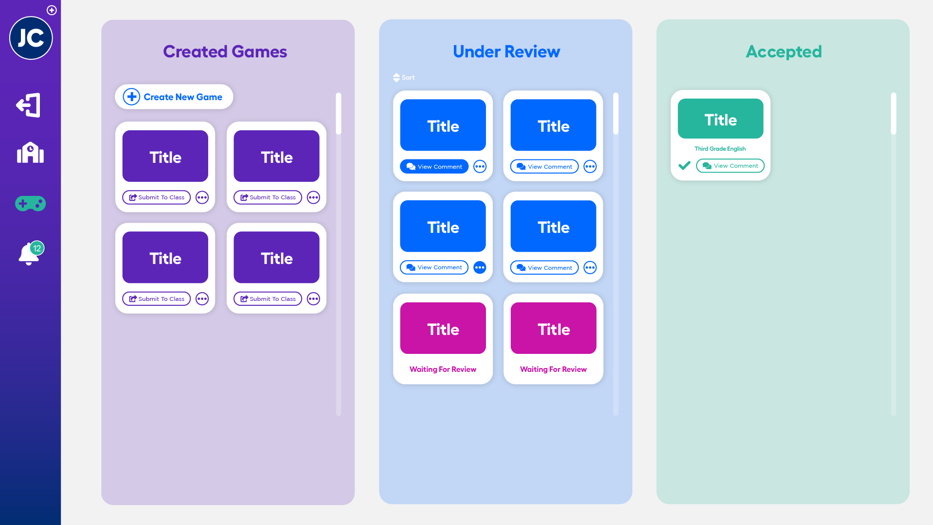
The redesign moved from structure outward: structure, then teachers, then students, so that each decision built on a stable foundation. Starting with navigation architecture prevented downstream inconsistency across the teacher and student layers.
Structure first: simplified paths, role-based entry points, standardized interaction patterns. Then teachers: dashboards built for live situational awareness. Finally students: every screen designed to answer the same three questions without interpretation.
Each layer had a deliberate tradeoff, and the tradeoffs were explicit: not concessions, but decisions.
Configurability for teachers, and exploratory freedom for students. Both were real losses: a teacher who wants a different view can't build one, and a student who wants to wander can't.
Scanability for teachers: fewer options, faster decisions during live instruction. Guided progression for students, to raise first-time success rates without help. The architecture favored guidance over exploration because the room was no longer there to catch anyone who wandered.
Designing for independent completion
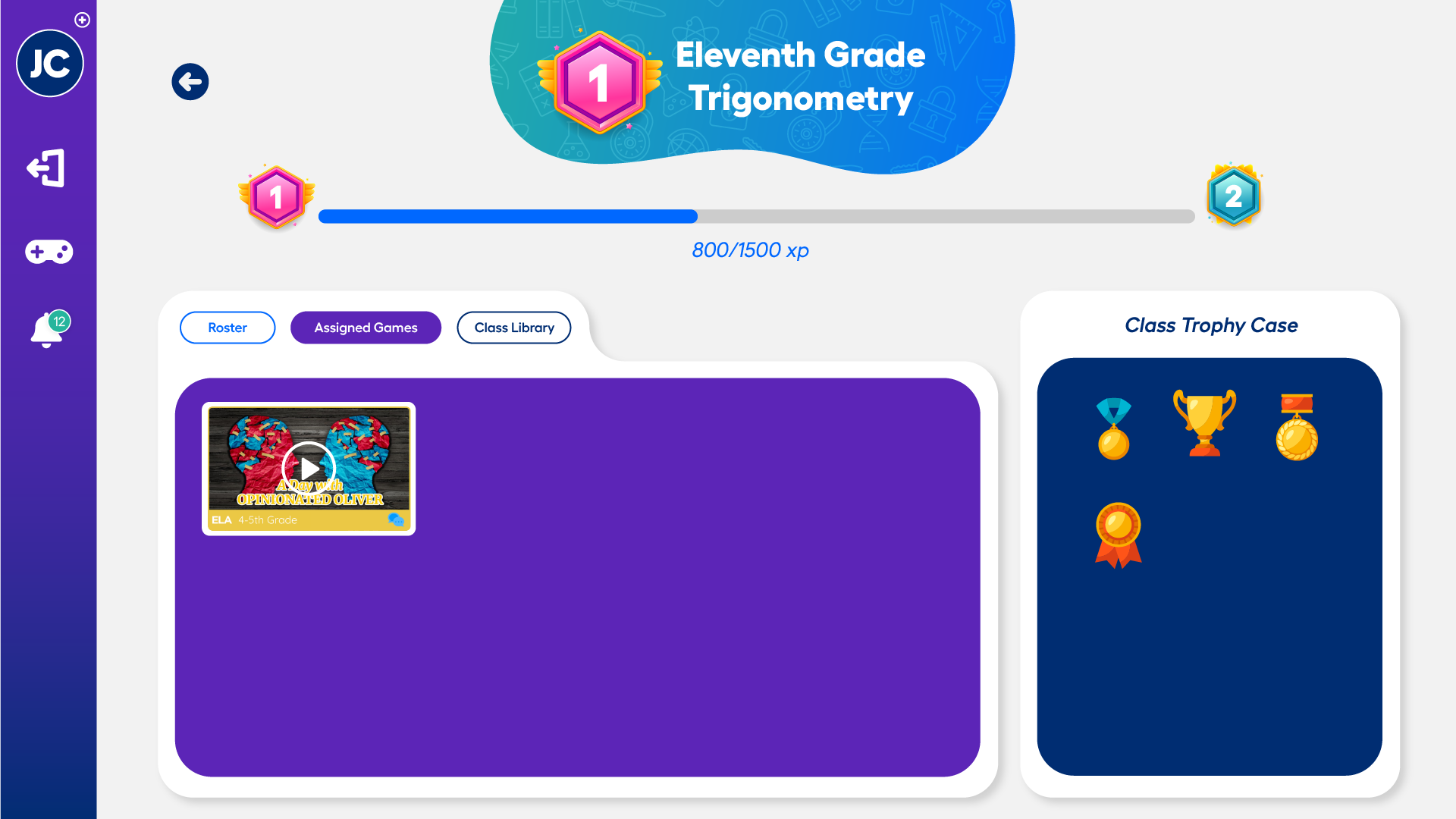
Students were most affected by the loss of classroom structure. The original experience assumed guidance lived outside the interface. Now the system had to provide it.
Every screen needed to answer the same three questions without hesitation: Where am I? What do I do next? How do I know I'm done? Not one of those is a feature request. Each is a thing a person in the room used to answer out loud.
The goal wasn't engagement. It was making independent completion feel achievable, without a teacher, a classmate, or anyone to ask.
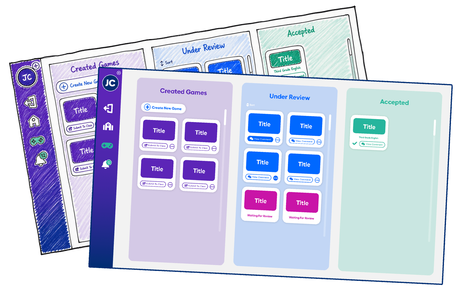
From something teachers managed, to something that supported them
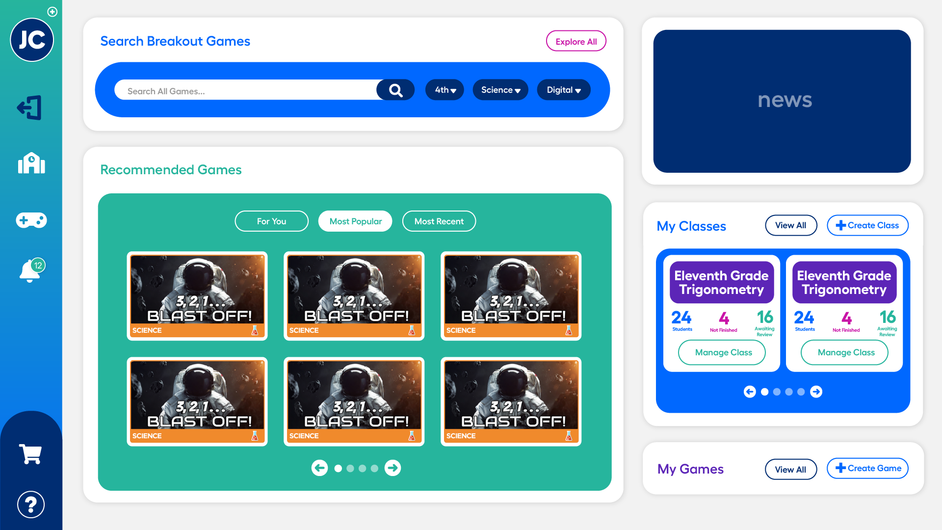
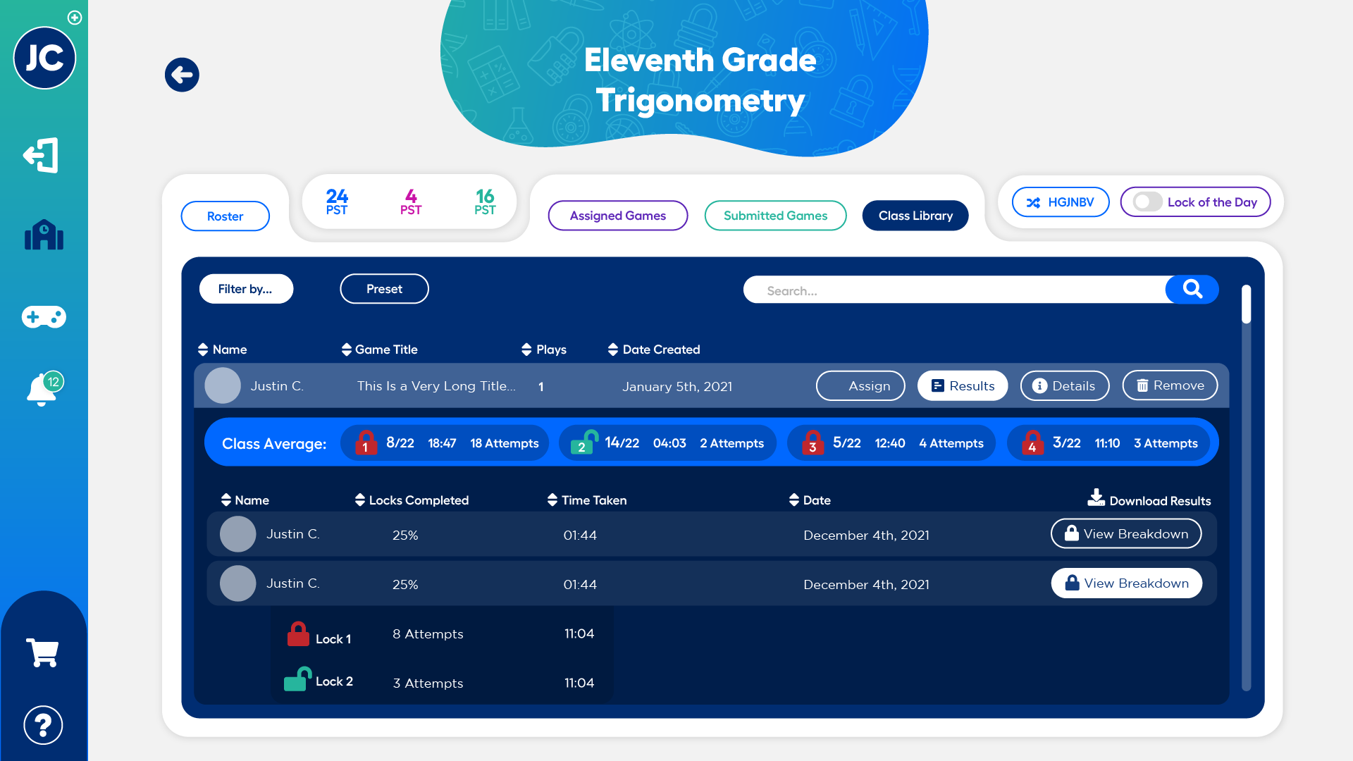
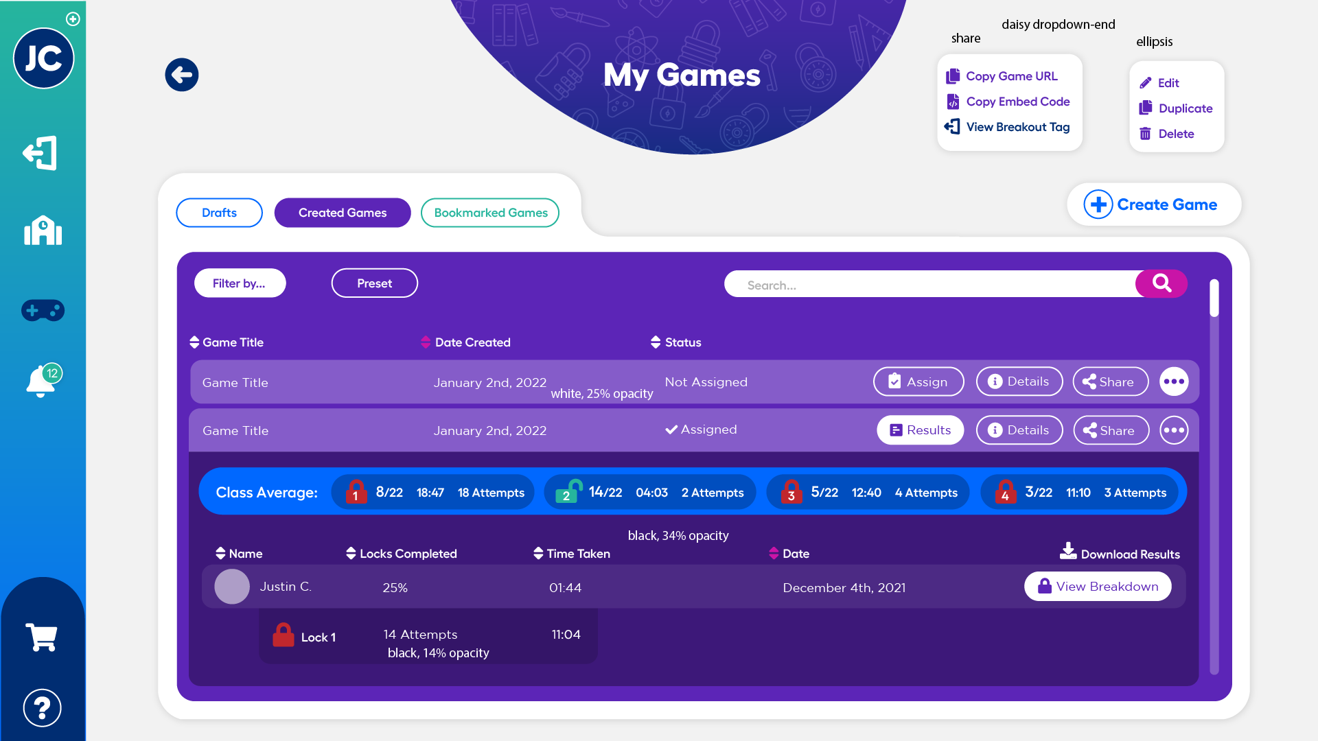
Teachers were facilitating learning and managing the platform at the same time; every extra interaction competed with instruction. The dashboard was redesigned for situational awareness, not feature depth.
Three things it had to do while a lesson was running:
-
At-a-glance class progress. Instant visibility into how the room was moving, without navigating away from the lesson.
-
Student-level status. Clear identification of who was stuck, who was done, and who needed intervention, surfaced automatically rather than looked up.
-
Quick intervention actions. One-step actions during live instruction. We prioritized scanability over configurability.
The distinction that mattered: a dashboard that answers a question you went looking for, versus one that tells you something before you knew to ask. Under live instruction only the second one is usable, because the first costs attention the teacher doesn't have.
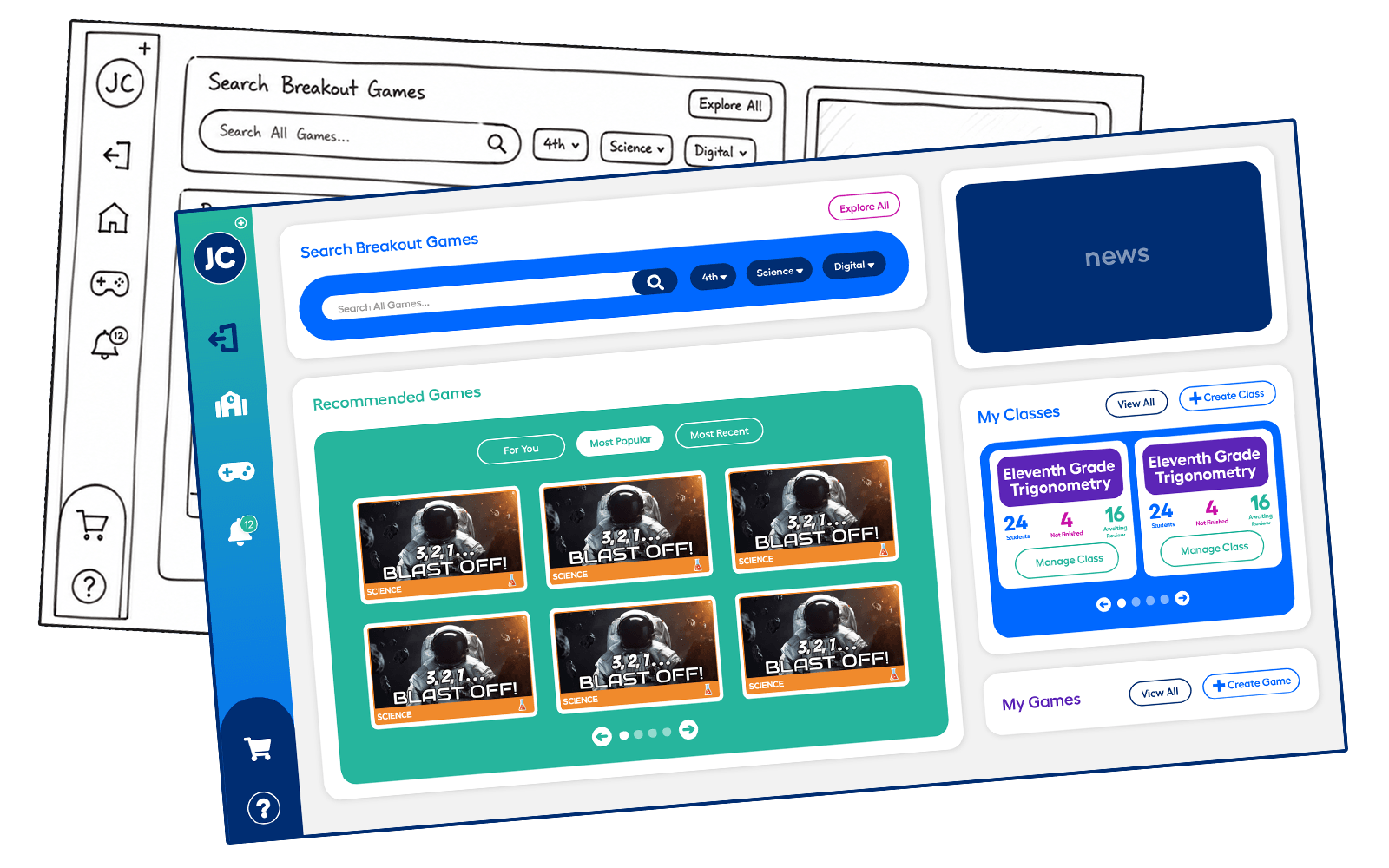
Consistency that scales across classrooms
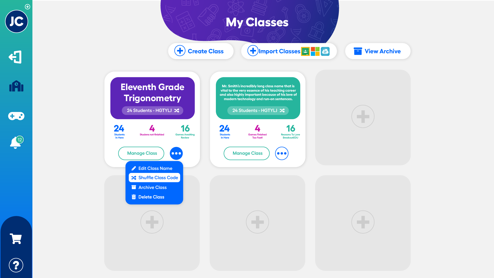
Administrators cared about reliability at scale. Schools with very different levels of technical maturity needed to trust that the platform would behave the same way in every classroom.
The work standardized navigation and interaction language across modules, so the system felt dependable enough to commit to, not just pilot. That sounds like polish and isn't: an inconsistency a designer would call minor is, for an administrator deploying to a hundred rooms, a support ticket multiplied by a hundred.
The platform shifted from something administrators provisioned to something they could confidently deploy across districts, environments, and skill levels.
Structure provided clarity. Identity supported confidence
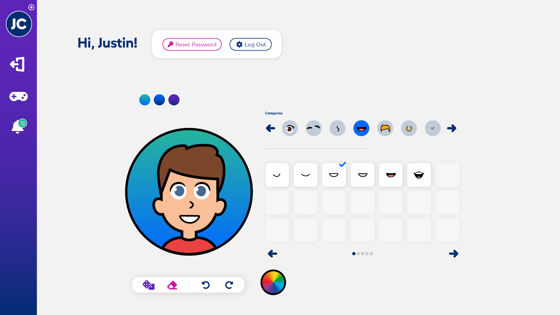
Features like avatar creation played a stabilizing role in the absence of classroom context. Remote students lacked the social and environmental cues that reinforce belonging.
Personalization introduced ownership, emotional grounding, and continuity across sessions in a low-context environment. It's the part of this project easiest to mistake for decoration, and it wasn't: in a room where the social anchors had disappeared, giving students something to call their own kept them connected to the experience.
The original brand wasn't built for a digital platform
BreakoutEDU's visual identity was built for physical environments where brand inconsistency went largely unnoticed. Teachers and students were focused on the room, not the screen.
In a fully digital context, that changed. Under real-time classroom pressure, visual noise and unclear hierarchy created hesitation at exactly the wrong moments, the moments a student was already unsure whether they were doing it right.
A rebrand. Replacing the identity outright would have cost the playful character that made the product recognizable to students and teachers who already knew it.
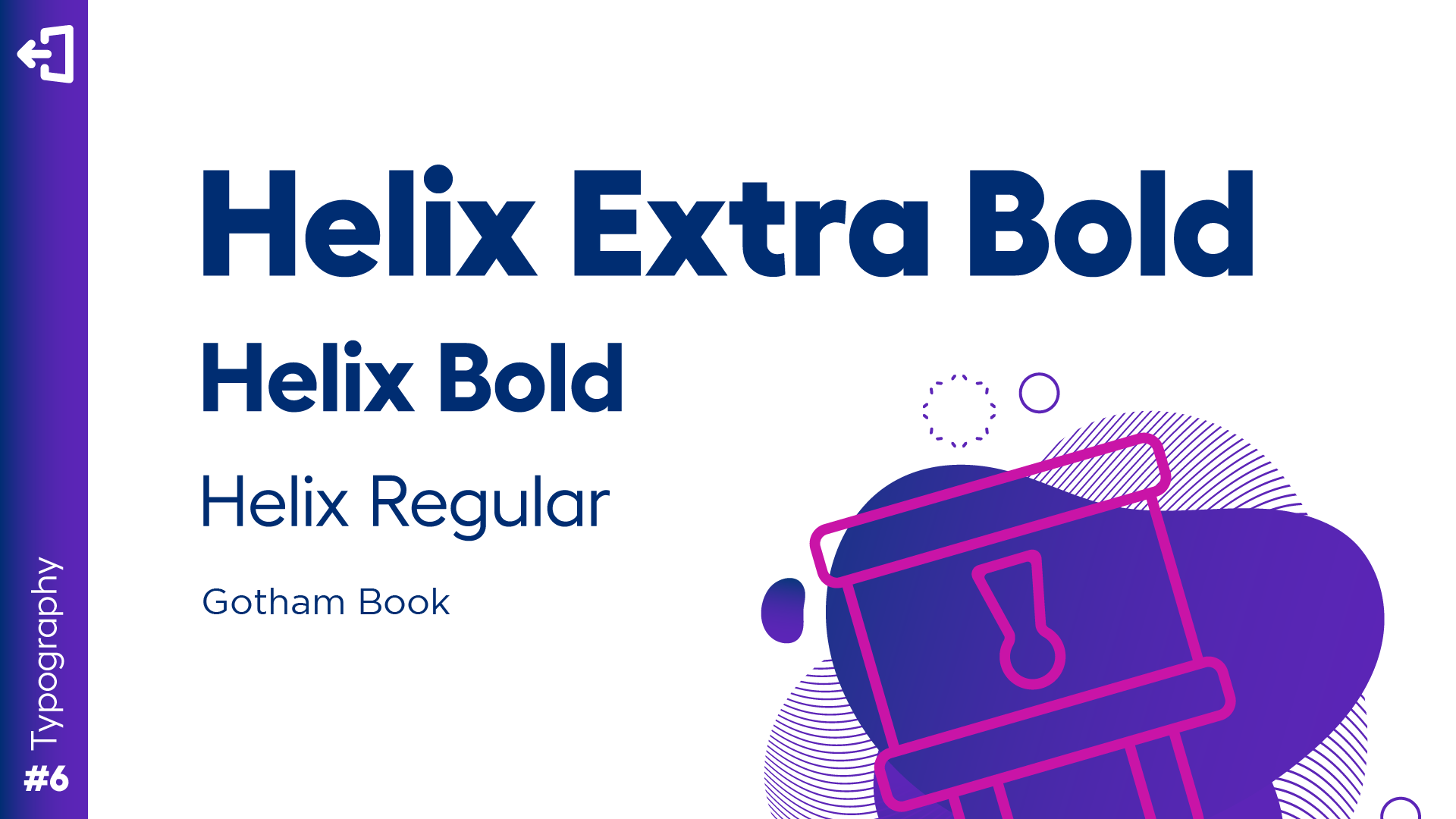
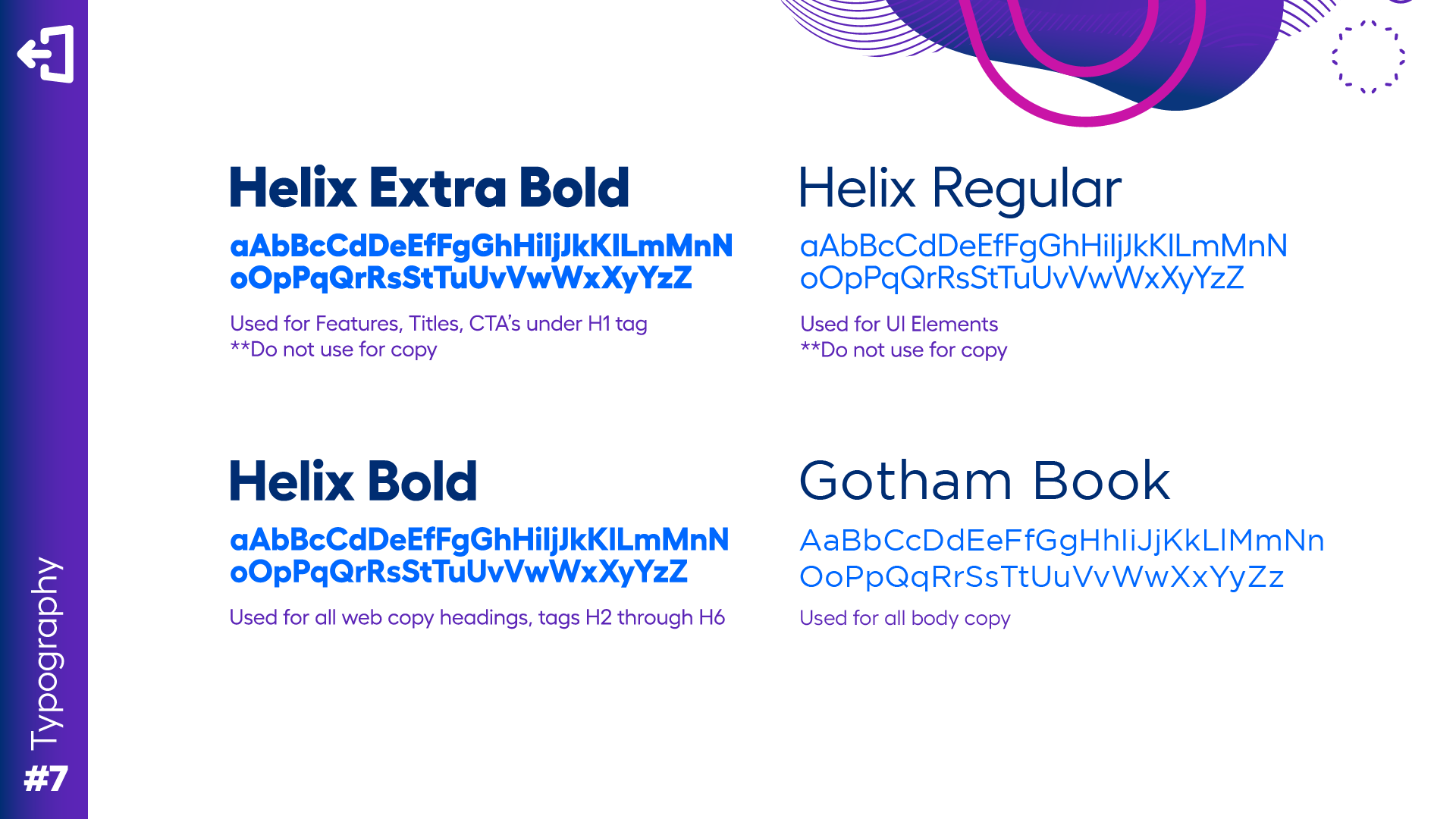
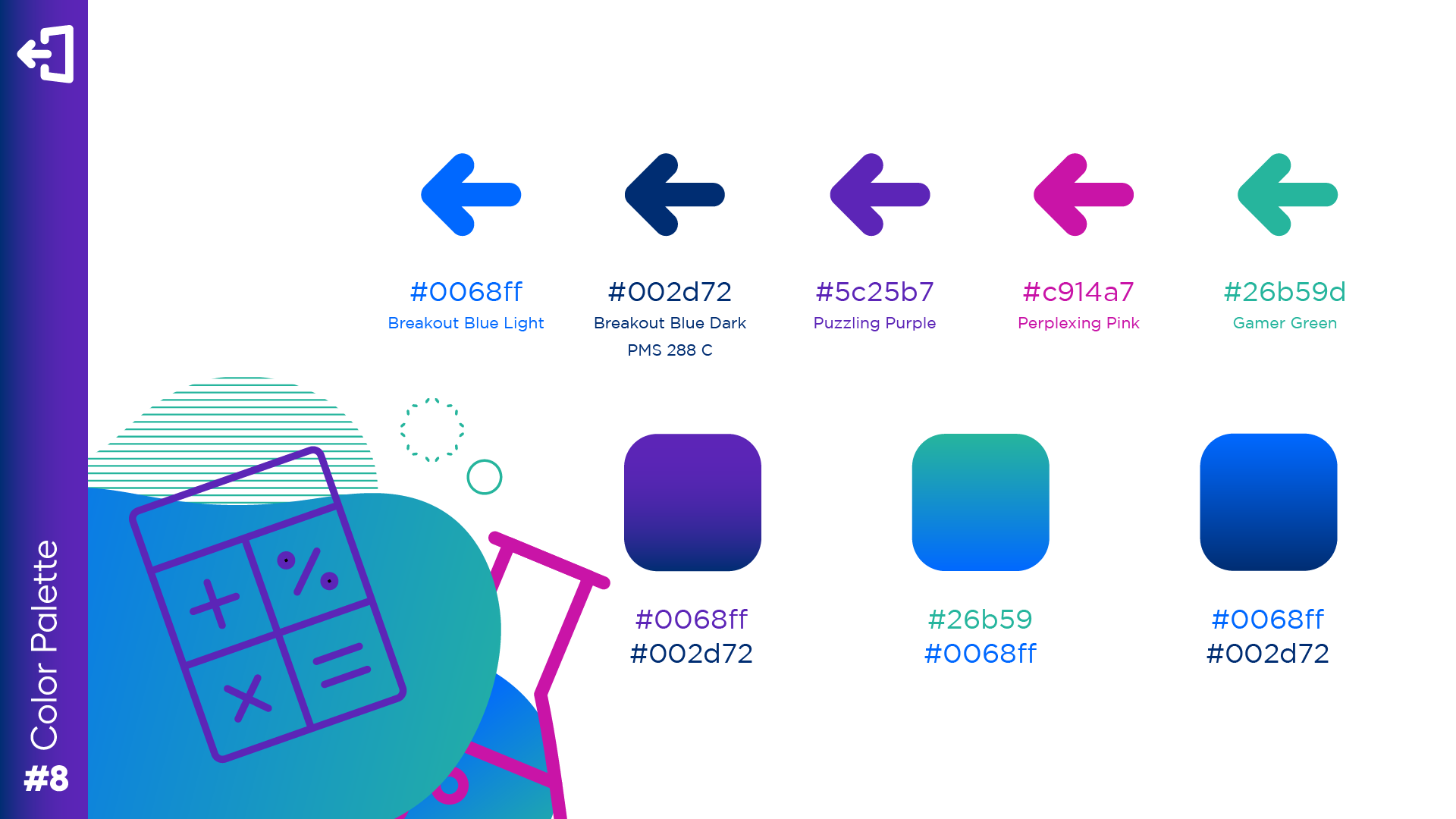
A refinement: a more accessible, consistent color system that held up across screen types and varied classroom lighting, and a stronger typographic hierarchy for fast scanning during live instruction, where seconds matter and rereading isn't an option.
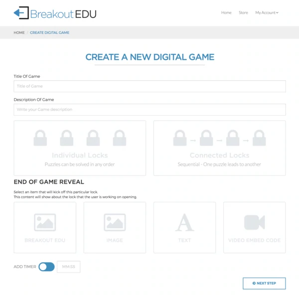

The goal wasn't to remove personality. It was to make sure the brand could hold up under conditions it was never originally designed for: friendly enough for students, trustworthy enough for the administrator deciding whether to deploy it.
A brand that works for everyone
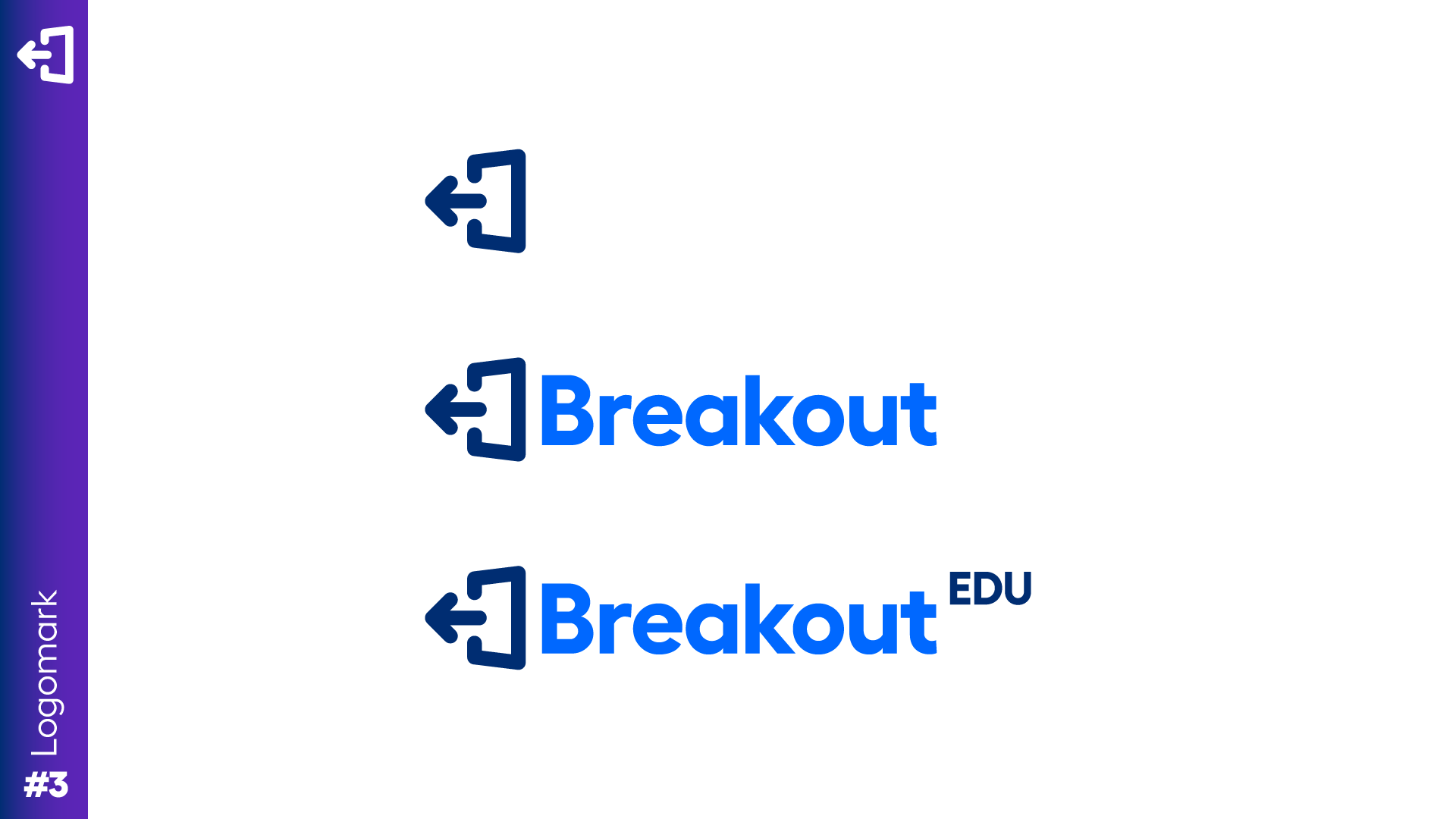
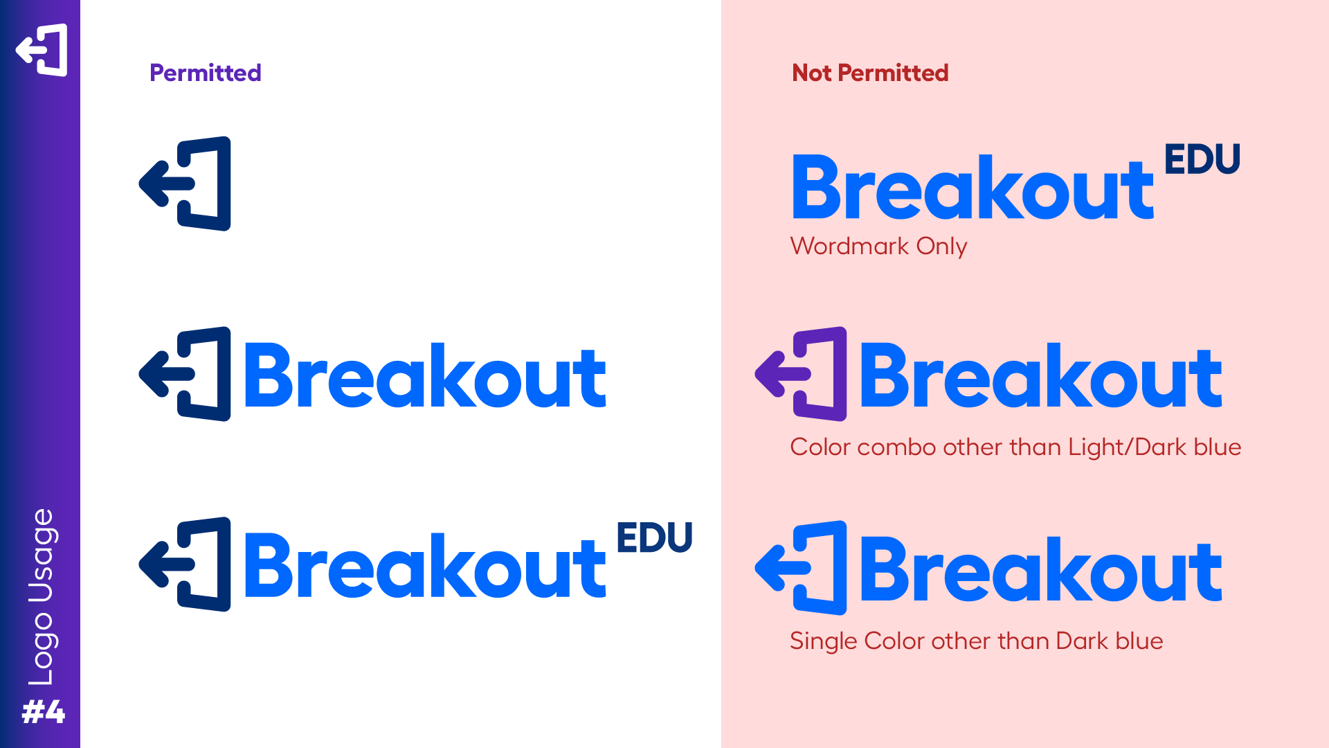
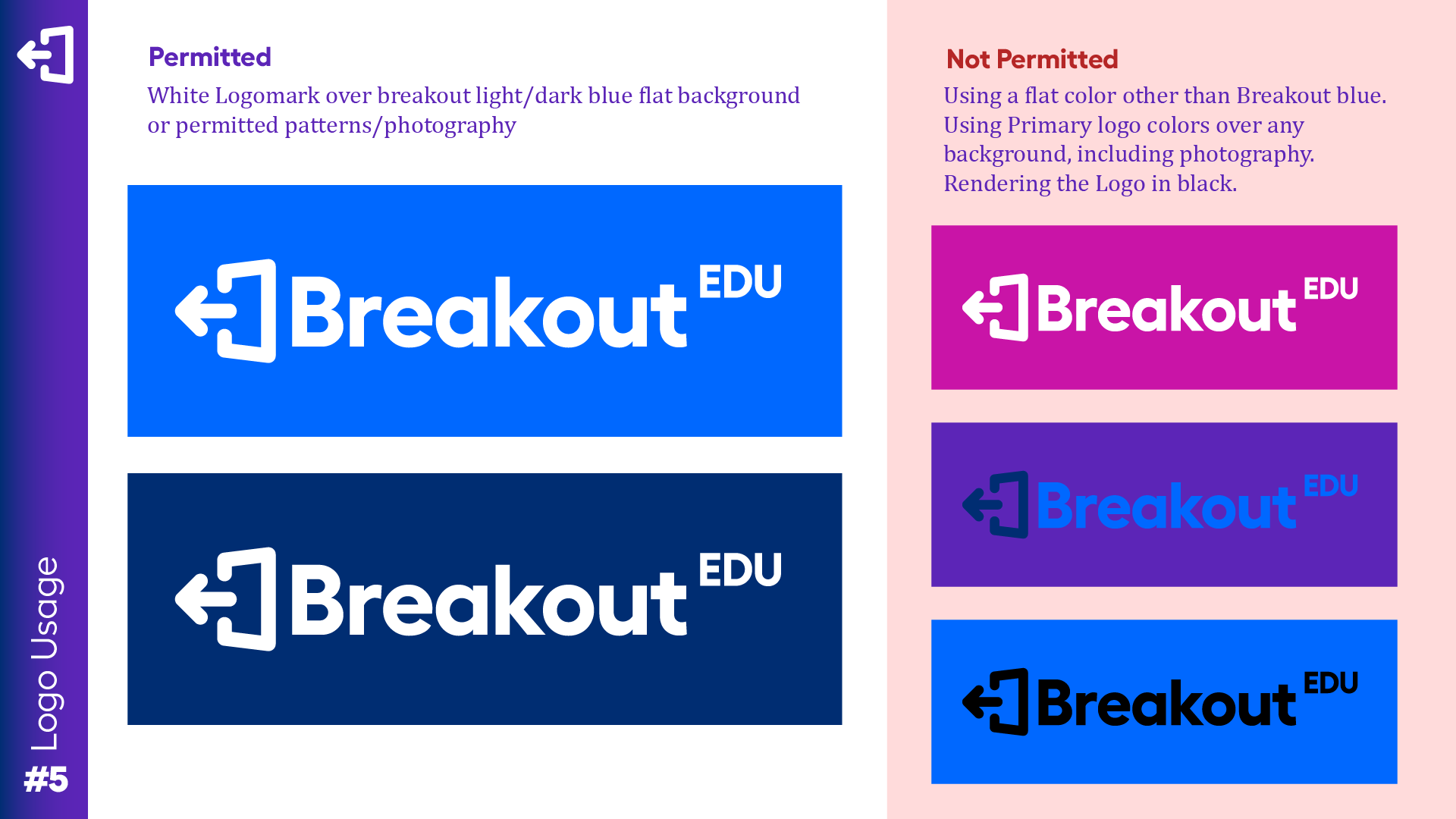
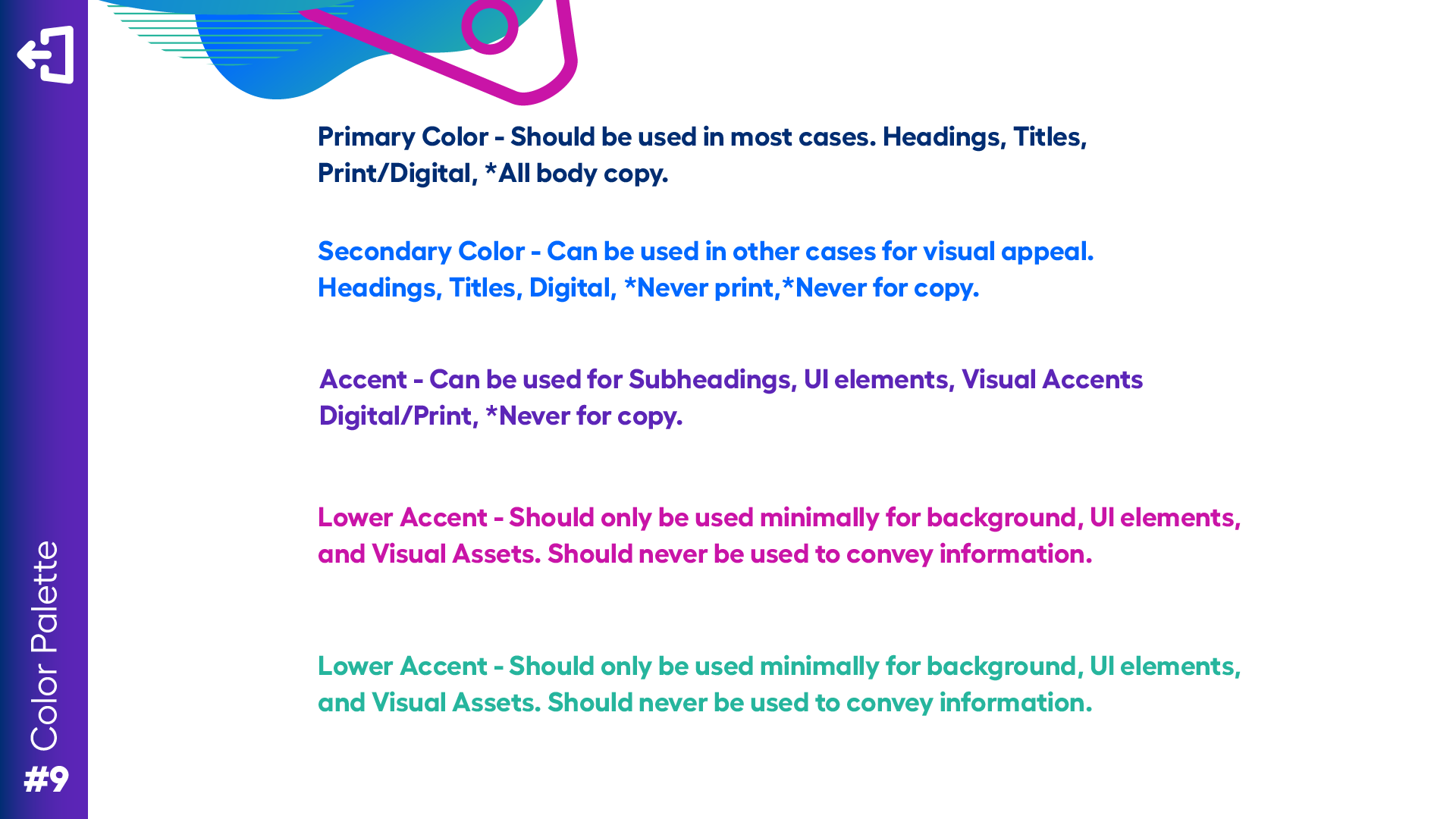
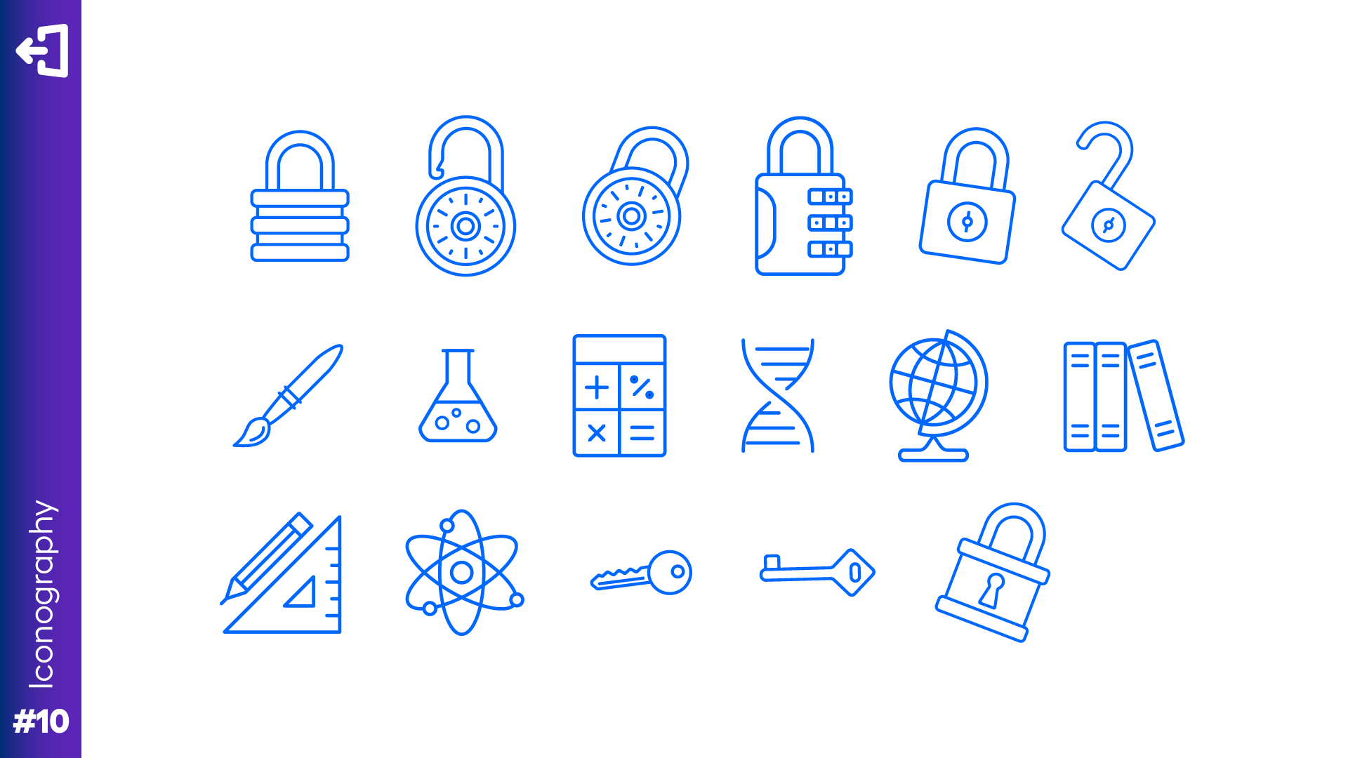
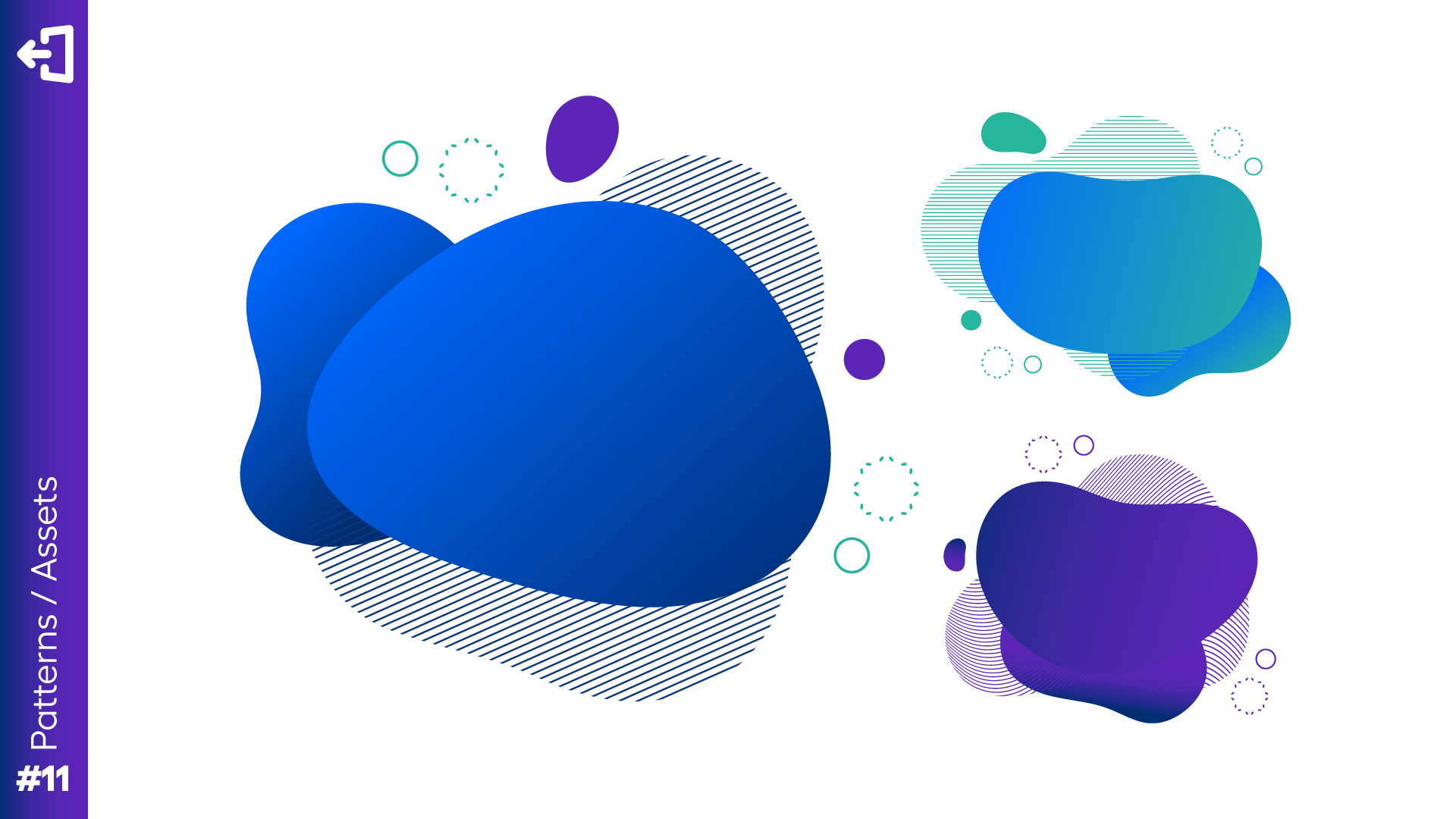
The refinement was documented as a system rather than a set of files, so it would survive being handed to people who weren't in the room when it was decided.
- Color
- a refined palette that maintains energy while improving accessibility and readability across screen types and classroom lighting.
- Typography
- clear hierarchy and improved legibility, for teachers scanning dashboards and students navigating independently.
- Illustration
- a consistent style that feels age-appropriate for students while staying professional enough for the people buying it.
The redesign made independent learning possible when classroom support no longer was
BreakoutEDU shifted from a classroom companion into a system that could reliably support independent learning at scale.
- Less intervention
- students completed activities with significantly less teacher intervention across pilot usage.
- Fewer interruptions
- teachers reported fewer platform-related interruptions during live instruction.
- Wider deployment
- schools with varying technical maturity began deploying in remote and hybrid environments.
Student confidence continuing without help, not engagement time and not click reduction. A student who finishes a task without believing they did it right hasn't learned anything the next task can build on.
Visible answers at every step. The system had to be legible, not just usable.
Usability sessions scored on whether participants felt confident continuing without guidance, rather than on time or completion. That measures whether a mental model holds during a session, but not whether it holds across a semester of daily use. Sustained independence in production is the thing this method can't reach, and the first thing I'd instrument next.
Most importantly, students could keep learning in environments where classroom support was no longer available. That was the measure that mattered.
What I took from it
-
Design for confidence, not just completion.
Early usability data looked fine. Users were completing tasks, and it wasn't until we dug into how they felt after completing them that the real problem surfaced. Confidence in the system, not just success in the moment, determines whether a product works under real conditions. I now treat confidence as a measurable design outcome alongside completion.
-
When environments become uncertain, design enables continuity.
This wasn't about improving an experience that already worked. It was about keeping learning possible when the environment that made it work disappeared. The platform had to take over what the classroom used to provide, and that shift in framing changed every decision downstream.
-
Guidance and freedom are a real tradeoff, so make it out loud.
Every layer of the redesign required choosing between flexibility and confidence. Naming those tradeoffs as decisions rather than compromises is what let engineering, product, and curriculum agree on how much ambiguity the system could safely allow.