Case study · Glasswall Email Interceptor
A cloud security console that made automated protection observable.
Email Interceptor sanitizes every attachment before it reaches an inbox. The hard part was never the sanitization. It was giving administrators confidence in a process they could not see.
- Existing tooling
- 80% of surveyed administrators already ran email security tools
- Switching intent
- 92% said they would switch after seeing CDR
- Revenue opportunity
- $500K projected annual revenue from early interest
What Email Interceptor is
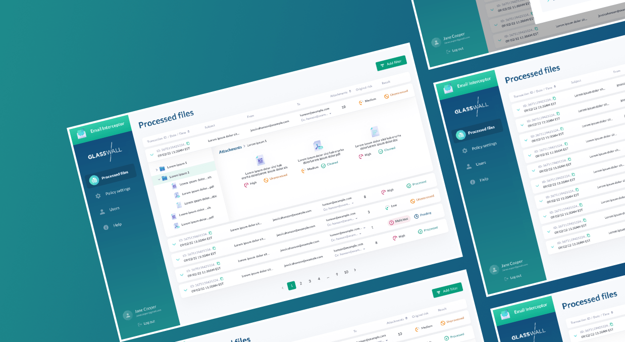
Glasswall Email Interceptor is a cloud security console. It intercepts email attachments, sanitizes them through Content Disarm & Reconstruction, and delivers a rebuilt file that carries none of the original threat.
The technology already worked. What the product needed was a way for a security administrator to see it working, and to explain it to someone else afterward.
Four things make that possible:
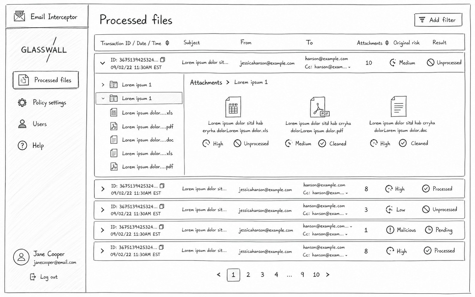
- The transaction log
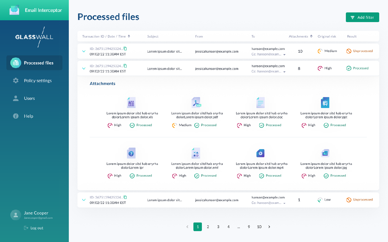
- records every attachment's full lifecycle: sender, recipient, file type, timestamp, and outcome.
- Policy controls
- mirror the organization's real structure, so risk tolerance can differ by department without chaos.
- Risk alerts
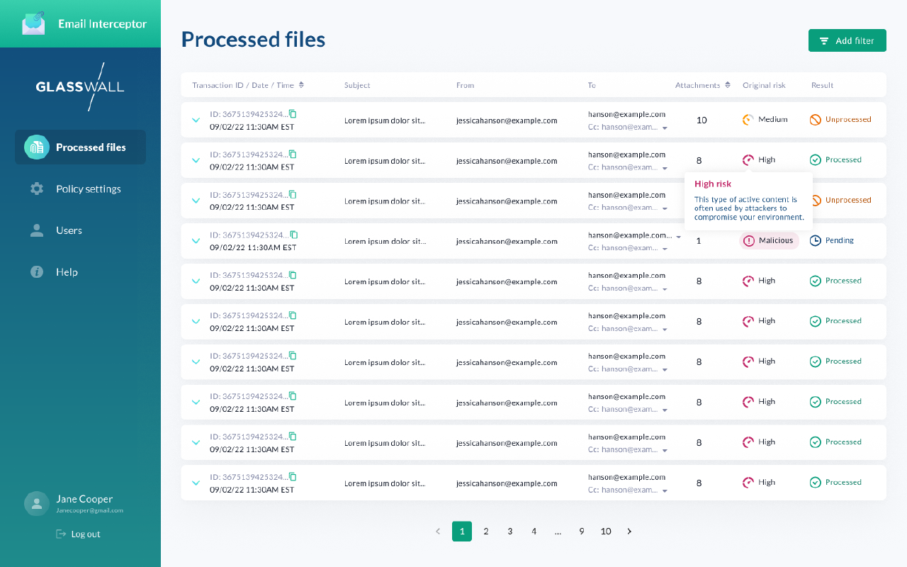
- surface what still warrants human review, prioritized for clarity rather than urgency.
- The File Tree
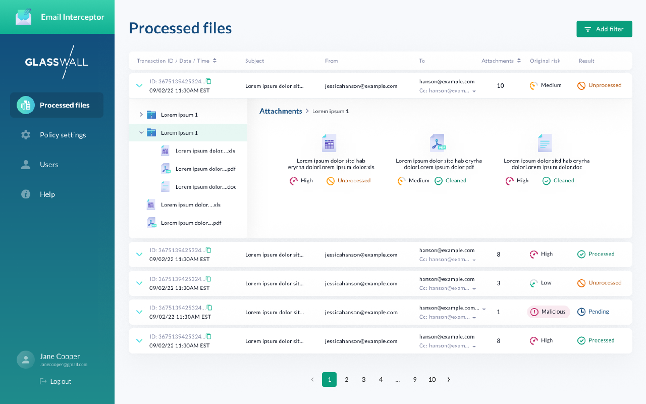
- preserves nested archive structure, so a threat's location stays legible rather than flattened.
None of that structure came from the technology. It came from what the problem turned out to be.
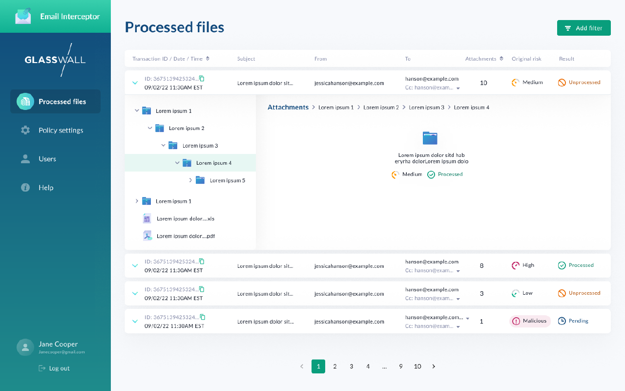
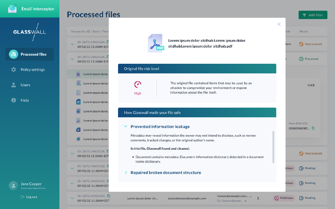
Automation removed effort, but it also removed reassurance
Security administrators were being asked to trust a process they could not see, could not verify, and could not explain to anyone else. The tools that existed either hid the logic entirely or dumped raw data that required constant interpretation.
Three pressures met in the same place, and none of them could be solved by making the sanitization better:
- Security administrators
- carried responsibility for threats they could not see and processes they could not verify.
- Organizations
- needed different risk tolerances across departments without introducing policy chaos.
- Existing tools
- either hid critical processing logic or exposed raw logs that required constant interpretation.
Make automated protection feel observable, controllable, and dependable.
That was the product goal, and it set the bar for everything after it. Every automated action needed a visible explanation: not a guarantee, but a record.
Lead Product Designer on a cross-functional team
I led product design from early validation through interaction design and usability testing, working closely with product leadership, engineering, cloud architects, and security subject-matter experts.
Because the product introduced a new way of operationalizing Content Disarm & Reconstruction, much of the work was translation: taking highly technical security concepts and turning them into workflows administrators could understand, trust, and act on.
The challenge extended past designing screens. Administrators would ultimately be accountable for decisions the system made on their behalf, so every workflow had to balance automation against transparency. Success depended on building enough shared understanding across product, engineering, and security that automation could feel observable, explainable, and trustworthy.
Before designing the interface, the problem had to be confirmed as worth solving
80% of surveyed administrators already relied on email security tooling, so this was not an unserved market. It was a dissatisfied one. 92% said they would switch after seeing what CDR actually did.
That gap between having a tool and trusting it is where the opportunity sat. Early interest supported a projected $500K in annual revenue, but the number mattered less than what produced it.
The opportunity wasn't technical differentiation. It was making a security outcome feel trustworthy, something existing tools had consistently failed to do.
Each validation finding pointed at a specific thing to build:
| Research finding | Product decision |
|---|---|
| Administrators can't verify what automation did | A transaction log as the product's center of gravity |
| Departments carry different risk tolerances | Policy controls mirroring real org structure |
| Raw logs create interpretation load, not clarity | Risk alerts prioritized for clarity over urgency |
| Policy assignment meant command-line work | Visual Azure group integration |
Designing the system before designing the screens
Before any interface work, I spent time with the cloud engineers and product leadership working out what the system would actually do. Not as a hand-off or a requirements review, but as design work. In a product where every screen is a report on an automated decision, the behaviour of the system is the interface.
The method was to draw it. I brought diagrams into working sessions rather than documents, because a diagram is something a group can disagree with precisely. Engineers could point at a path and say that isn't how the service behaves; product leadership could point at another and say we're not funding that in v1. Both are answers you want before you've designed a screen around them.
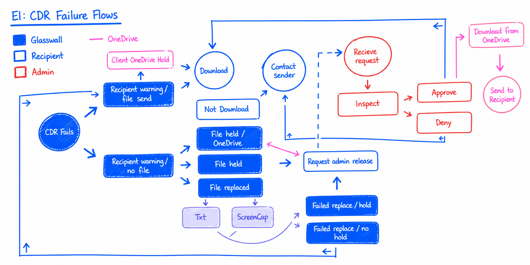
Mapping this way kept surfacing decisions nobody had made yet, and they were rarely purely technical. If a file is held, does the recipient learn it existed at all? When a file is replaced, is a text extract or a screen capture the honest substitute? Who is allowed to request a release, and what does an administrator need to see before approving one? Those look like engineering questions and they are product questions, which is exactly why they needed both groups in the room.
Three things came out of working this way. The interface was designed against what the system could really do, instead of an optimistic version that would have to be walked back. Scope conversations got concrete early, because cutting a path on a diagram is cheaper than cutting a screen. And the team left with one shared vocabulary for these outcomes: held, replaced, released. That became the language the transaction log itself uses.
Trust is built through visibility, not claims
Instead of treating CDR as a background service, the interface was designed to surface every layer of the process. Each automated action had a visible explanation an administrator could point to.
Four questions the interface has to answer for every single file:
-
What was intercepted. Every attachment logged with full context: sender, recipient, file type, timestamp.
-
What was changed. CDR modifications surfaced explicitly, so an administrator can see exactly what sanitization removed or reconstructed.
-
What risk remained. Residual risk indicators separating what is safe from what still warrants human review.
-
Which policy decided. Every outcome tied back to a specific rule, making governance auditable and reducing second-guessing.
Those four answers are what turns a black box into a record. An administrator who can answer all four can defend the outcome to an auditor, a manager, or the person whose attachment was rebuilt.
One question shaped every scoping decision
“What does an administrator need to see to feel confident walking away?” The MVP test
Confidence walking away is a higher bar than task completion. It rules out anything that only works while someone is watching it. Four things cleared that bar and made the MVP:
- Transaction log
- a complete lifecycle record for every attachment: who received it, how it was processed, what was removed.
- Policy controls
- rules that reflect real organizational structures, not flat permission models that ignore departmental risk variation.
- Risk alerts
- clarity over urgency noise: alerts that help administrators prioritize without creating alert fatigue.
- Azure group integration
- policy assignment through a visual interface, with no command-line dependency for administrators managing dozens of groups.
The Transaction Log as a trust surface
The log became the center of trust. Administrators could see who received what, how it was processed, what was removed, and which policy governed the outcome.
Not as raw data, but as a narrative of each file's journey. That distinction is the whole design. A table of events tells you that things happened; a journey tells you what happened to this file and why.
This is what transformed CDR from an invisible promise into a verifiable action. The technology did not change. What changed was whether anyone could point at it.
Impact visible before consequences occur
Policy changes carry real risk. A single misconfiguration can expose an entire department, and the administrator making the change usually finds out after the fact.
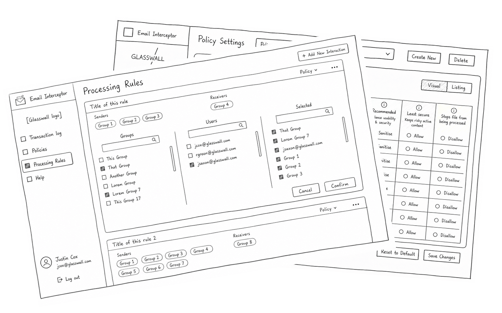
Three decisions moved that discovery earlier: the interface shows a policy's scope before activation rather than after, it mirrors Azure's group structure so the administrator isn't holding two mental models at once, and it replaces command-line workflows with visual confirmation.
Each rule states its own consequence in the column header: sanitise balances usability and security, allow keeps risky active content, disallow stops the file entirely. An administrator tuning a policy can see what they are accepting at the moment they accept it.
Together those let administrators change policy with confidence rather than caution, which in practice is the difference between a policy model that gets tuned and one that gets frozen.
In security, clarity is a control surface
Three attachment scenarios shaped the interaction model: deeply nested archives, high-volume file batches, and single-file transactions. The choice between a File Tree and a flattened File Span was not aesthetic. It was about risk interpretation.
File Span, a flattened list. Cheaper to build, faster to render, and simpler on screen. Task-based testing showed administrators misread both threat location and severity once hierarchy was gone.
The File Tree, despite higher engineering cost. Nested structure preserved the spatial relationships administrators were actually relying on to make accurate decisions.
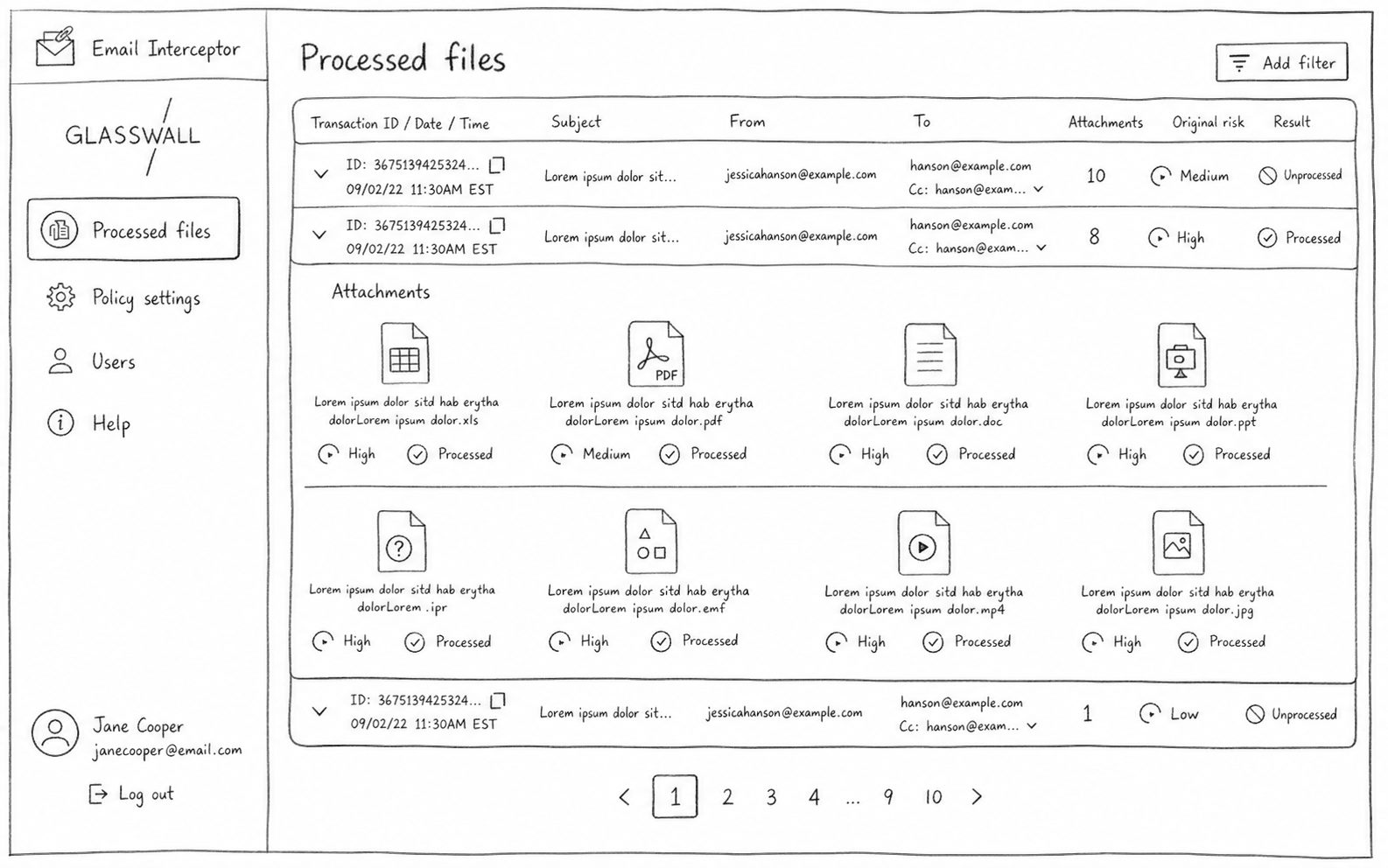
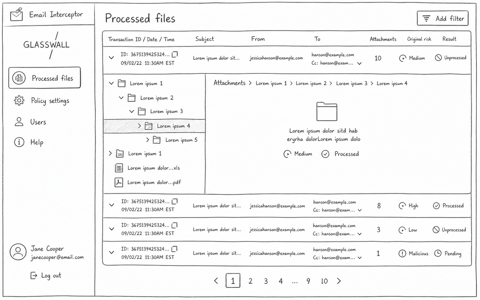
When the interface flattened structure, administrators made worse decisions. The visual model wasn't cosmetic. It was functional.
Accuracy in threat understanding outweighed the performance savings, so we took the cost on purpose. A faster interface that produces a wrong risk judgment isn't a cheaper product. It's a broken one.
The tree is doing real work here: an archive's nesting is the threat's address. Flatten it and every file looks equally close to the surface.
Testing measured decision confidence, not speed
Success wasn't defined by task completion time. It was defined by whether administrators could explain their decisions afterward, and whether they trusted the system enough not to manually reprocess files.
Three things were measured:
-
Risk location. Could administrators correctly identify where a threat lived within a complex file structure?
-
Outcome explanation. Could they explain why a file was determined safe without consulting documentation?
-
Trust in automation. Did they rely on CDR outcomes without manually reprocessing files they hadn't flagged?
“Success meant fewer second-guesses.” The standard we tested against
Administrator confidence in automated outcomes, not interface speed and not click reduction. A faster path to a decision nobody can defend is not an improvement.
Visible explanations at every step. The system had to be readable, not just reliable.
Task-based testing with security administrators, scored on interpretation accuracy rather than time on task. That measures whether a mental model holds, but not whether it holds up under months of daily use. Sustained trust in production is the thing this method can't reach, and the first thing I'd instrument next.
This work defined the foundation for a new product line
Email Interceptor reframed CDR from a background service into a visible security control, and that reframing outlasted the project.
- Market demand
- validated switching intent and revenue opportunity through early research, before a single screen was designed.
- Observable automation
- established visible CDR processing as a core product principle rather than an afterthought bolted on once engineering was done.
- Shared language
- created alignment between UX, cloud architecture, and engineering around one shared model of trust and transparency.
More importantly, it changed the emotional posture of the product, from a black box to a system administrators could stand behind. By designing for confidence, explanation, and accurate mental models, teams could rely on automation without surrendering accountability.
When nothing happening is the best outcome, the design made that silence understandable and trustworthy.
What I took from it
-
Trust is a design output, not a claim.
Administrators didn't reject automation, they rejected opacity. The hardest work wasn't showing that the system was safe. It was making the safety something a person could point at and explain.
-
The cheaper interface is sometimes the wrong one.
Flattening the file structure was faster to build and faster to render, and it made people worse at their jobs. Engineering cost was the right thing to spend to protect decision accuracy.
-
Measure the thing you actually want.
Time on task would have rewarded the wrong design. Testing for whether an administrator could explain their own decision is what surfaced which interface was really working.