Case study — MyAPU
A native student app built to replace uncertainty with momentum.
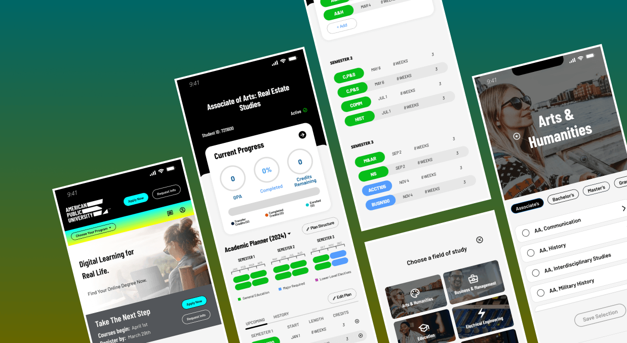
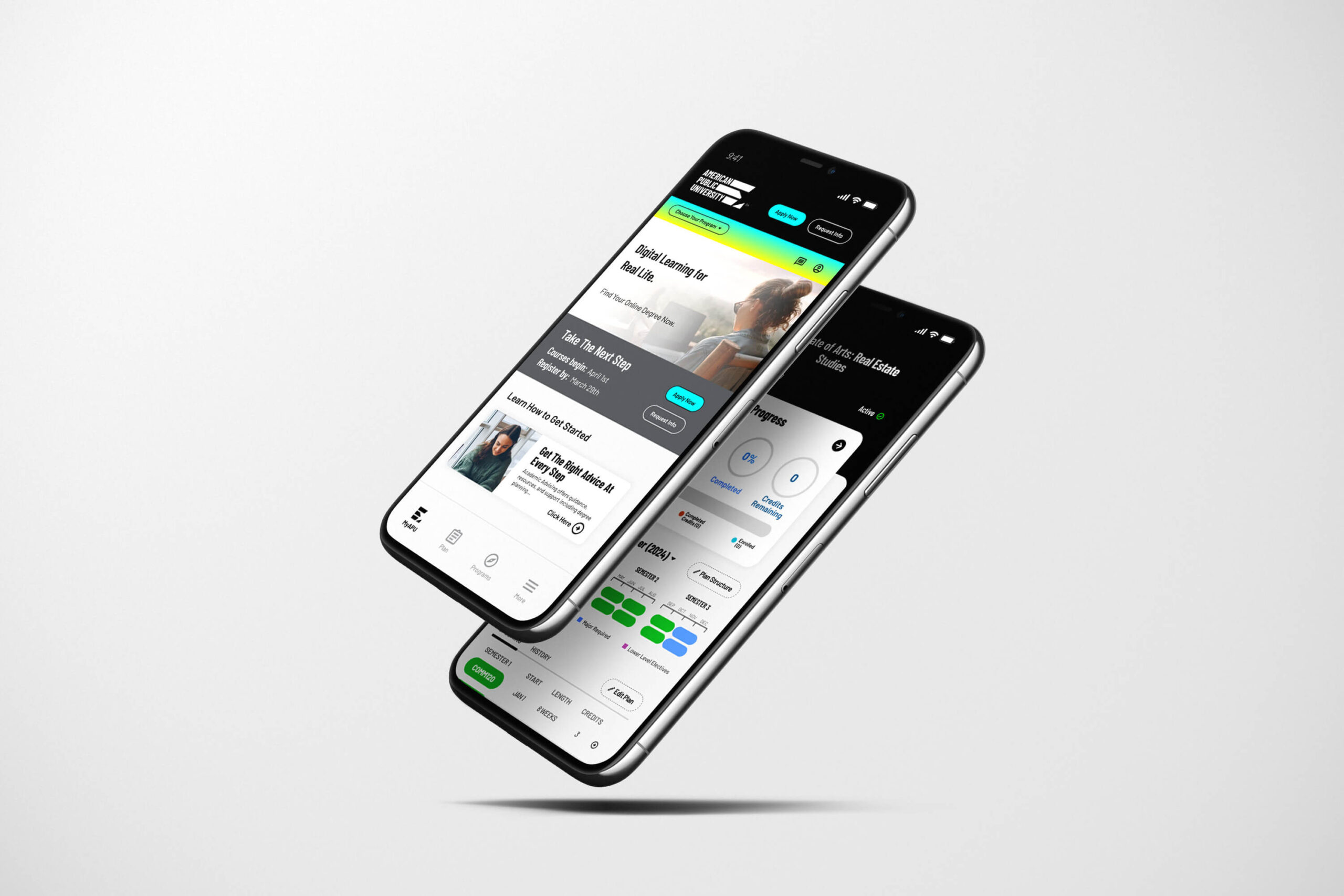
MyAPU is a mobile experience for American Public University students, designed as one continuous journey across the entire academic lifecycle rather than a set of disconnected systems.
- Adoption
- 396% increase in mobile app adoption
- Advising load
- 28% drop in advising outreach among app users
- Scope
- 3 student stages served by one product
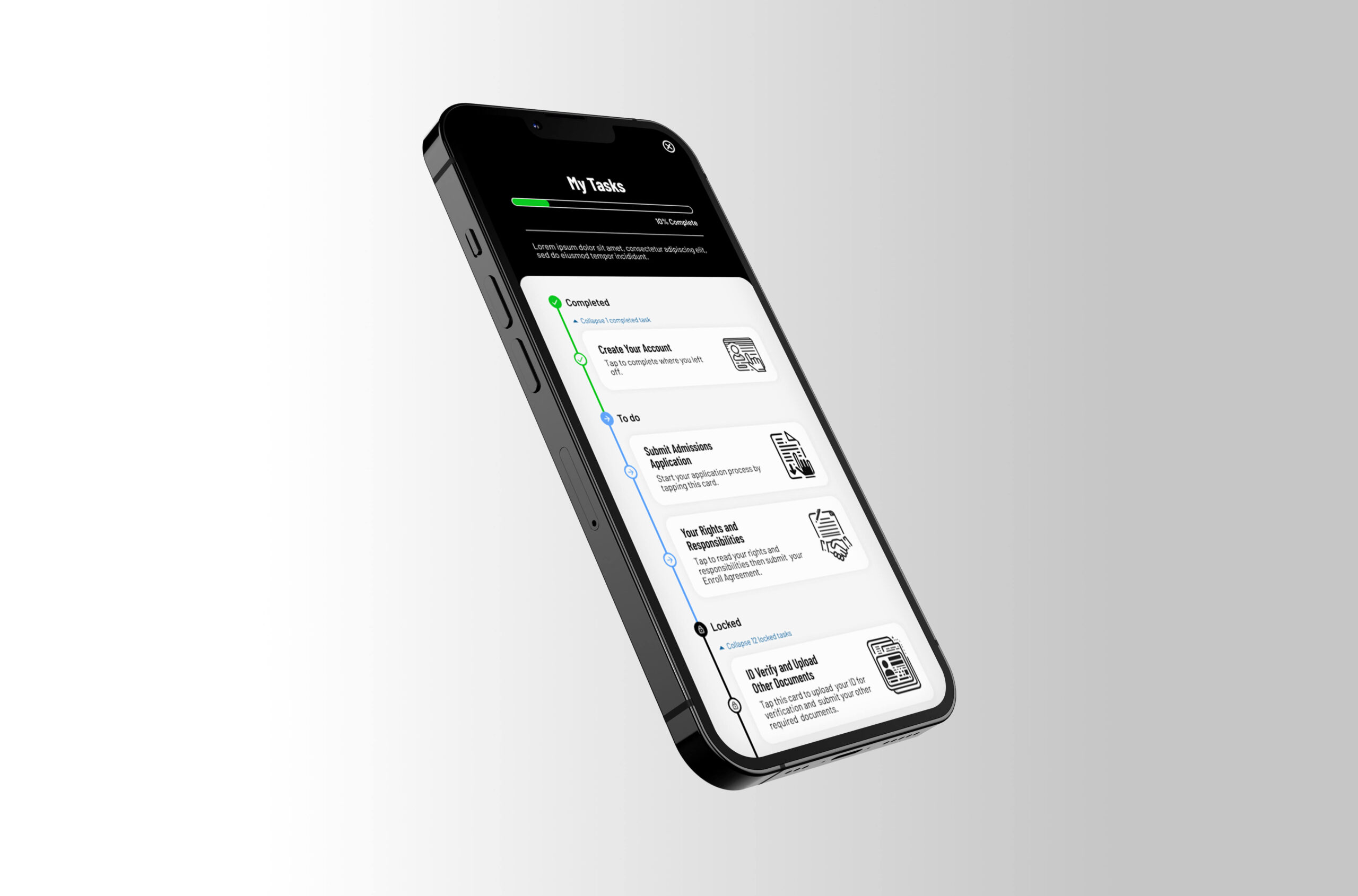
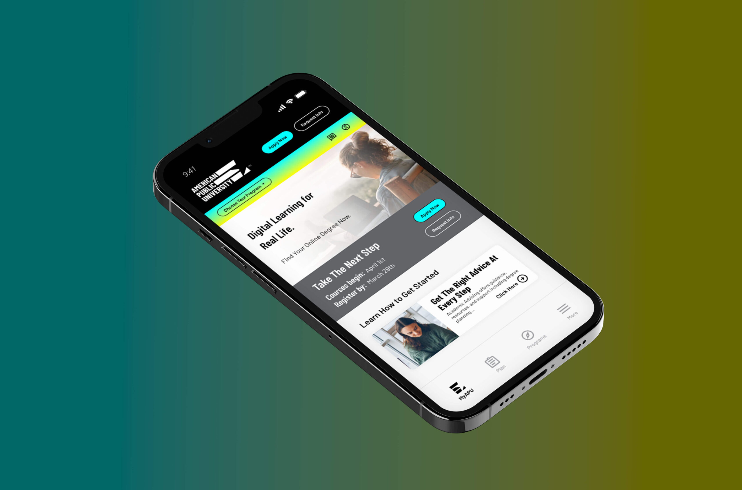
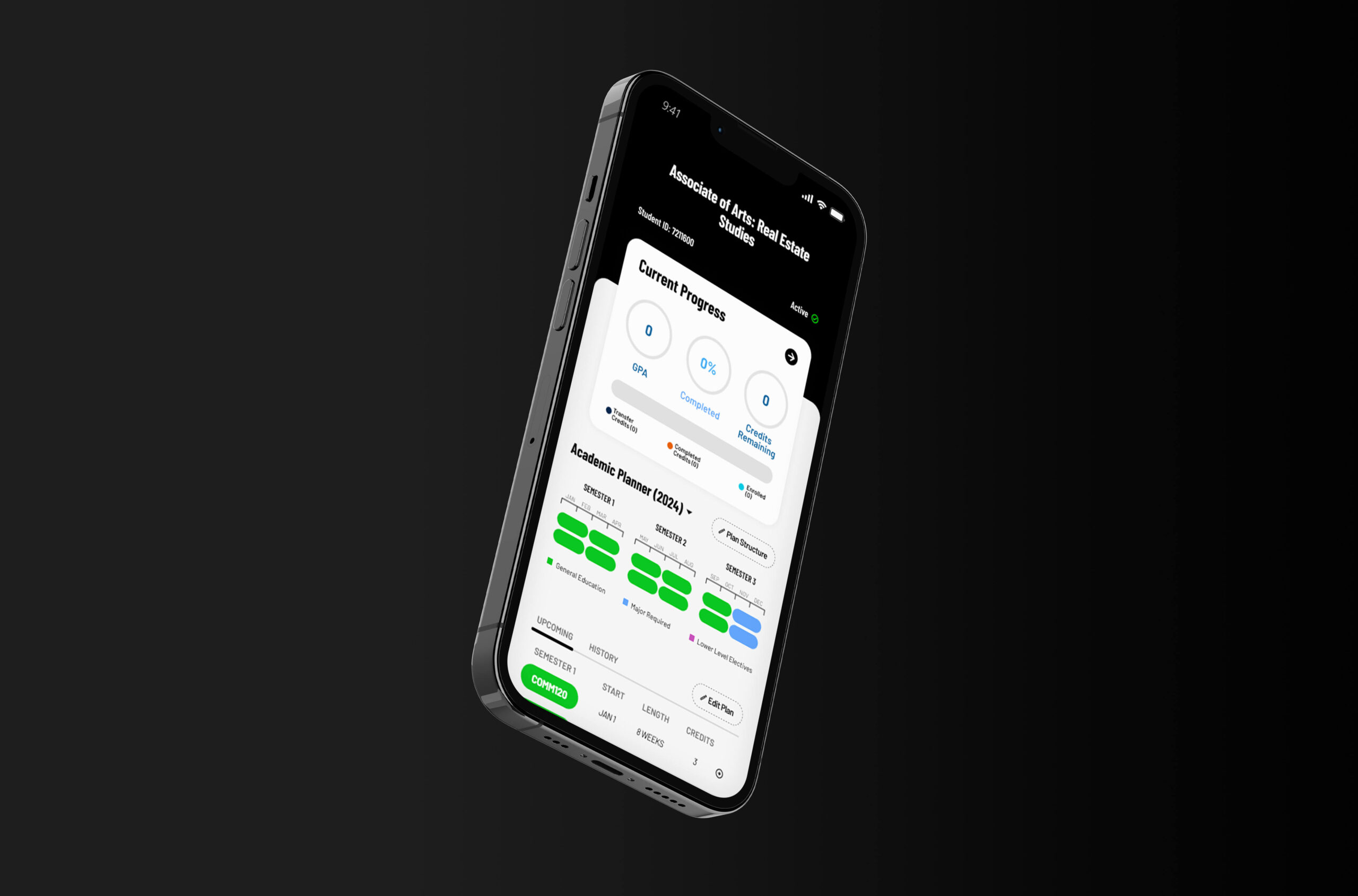
What MyAPU is
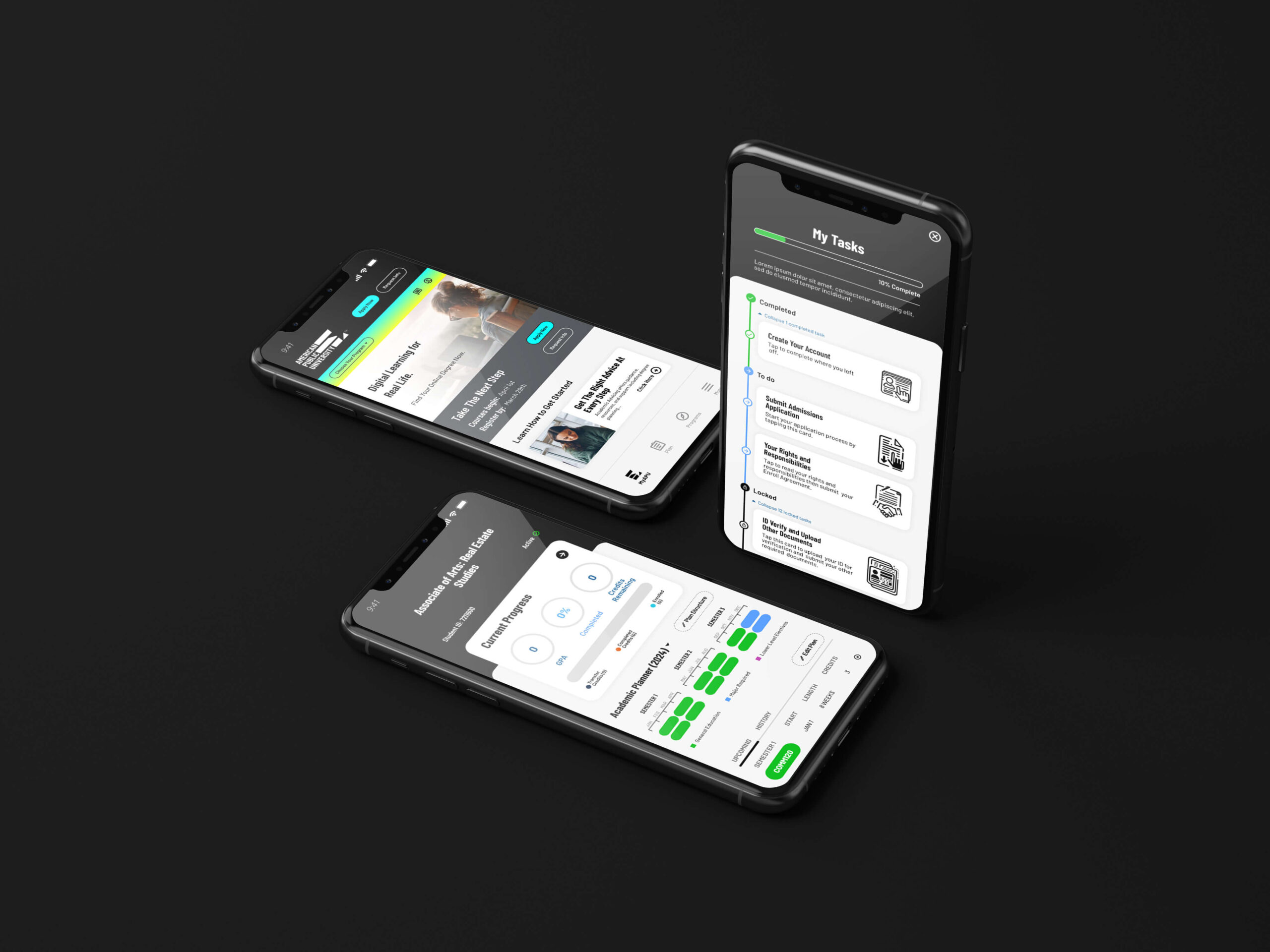
MyAPU is a mobile experience designed to support students across the entire academic journey, from wondering whether college is possible to managing a degree already in progress.
The challenge wasn't feature depth. It was creating a single, trusted experience that could serve several very different student mindsets without fragmenting the journey between them.
Historically these experiences lived in separate systems owned by different departments, and students relied on academic advising simply to work out what to do next. The product had to absorb that fragmentation. Three ideas carry it:
- One continuous journey
- the app adapts as a student moves between stages instead of handing them off to a different system.
- Visible progress
- completion states, milestones, and next steps are surfaced before a student has to go looking.
- Predictable feedback
- every successful action confirms the system is working on the student's behalf.
None of that framing was where the project started. Research is what moved it there.
Sole designer on a core team of five
I led design alongside a director of software engineering, a principal systems architect, a business analyst, and a product manager.
Cross-functional alignment spanned academics, admissions, compliance, marketing, and engineering, each with their own priorities and their own definition of success.
Managing that breadth meant the design work was never only about the experience. It was about creating enough shared clarity across stakeholders that the right product decisions could actually get made. Two of the hardest problems on this project turned out to be alignment problems rather than interface ones, and both are further down this page.
Across every stage of the student lifecycle, uncertainty was the barrier
Three groups used the same institution and got stuck for three different reasons. What they had in common was not knowing whether they could move forward on their own.
-
Prospective students. Questioned whether college was realistic for them at all, balancing cost, time, military service, work, and family.
-
New students. Faced complex onboarding steps and unfamiliar systems that felt intimidating, fragmented, and hard to trust.
-
Active students. Balanced coursework against real-life responsibilities while navigating disconnected tools with little visibility into long-term progress.
The issue wasn't simply usability. The systems failed to create confidence.
That distinction set the product goal. Not a cleaner version of the same systems, but a self-service experience that made progress visible, decisions clearer, and the academic journey feel achievable.
It also implied a standard I could hold every screen to, which is where the strategy came from.
One finding reframed the strategy: the barrier wasn't workflow, it was belief
The team had been measuring task completion, and by that measure the existing systems were not obviously broken. Students could finish the flows. They just weren't sure the flows were meant for them.
An early moderated session with a prospective student made the gap between those two things explicit.
“I kept clicking around, but honestly I didn't know if someone like me could actually do this.” Prospective student — early moderated session
She completed the task. She still left unconvinced she belonged there. No amount of usability polish addresses that, because the thing failing wasn't the interface, it was the student's read on her own odds.
So the research had to start measuring something it hadn't been measuring. Each method stayed, and each one changed what it was pointed at:
| Before | After |
|---|---|
| Journey mapping tracked task flows | Journey mapping charted emotional drop-off points across the full lifecycle |
| Usability testing measured task completion | Usability testing measured whether students felt capable after a flow |
| Prototyping was a design artifact | Prototyping became a stakeholder-alignment tool |
Why prototyping had to change jobs The reason
The rollout was phased, which meant scope decisions would be made incrementally by people who had never seen the whole experience at once. A prototype that only demonstrated a screen couldn't protect the parts of the journey scheduled for later phases.
So the prototype's real job became getting leadership to commit to the long-term experience before phased scope decisions locked us in. It was the difference between shipping three releases of one product and shipping three unrelated releases.
The standard every screen had to meet
With belief as the real barrier, the design needed a test any interaction could be held against, specific enough to settle arguments.
Every interaction should either reduce uncertainty or reinforce momentum.
The consequence was structural. Rather than treating enrollment, onboarding, and academic management as three experiences, the app was designed as one continuous journey that adapts as students move forward.
- Create continuity
- Students transitioning between stages should feel like they're progressing through one evolving product, not starting over in a disconnected system.
- Make progress unmistakable
- Completion states, onboarding milestones, and next-step guidance are surfaced proactively, so students always know where they stand without asking.
- Build trust through feedback
- Submitting documents, registering for classes, updating a degree plan — every successful interaction confirms the system is working on the student's behalf.
The same standard, three different jobs
Reducing uncertainty means something different at each stage. A prospect needs to believe the thing is possible; a new student needs the first month not to overwhelm them; an active student needs it to cost as little time as possible.
For prospects: belief before commitment
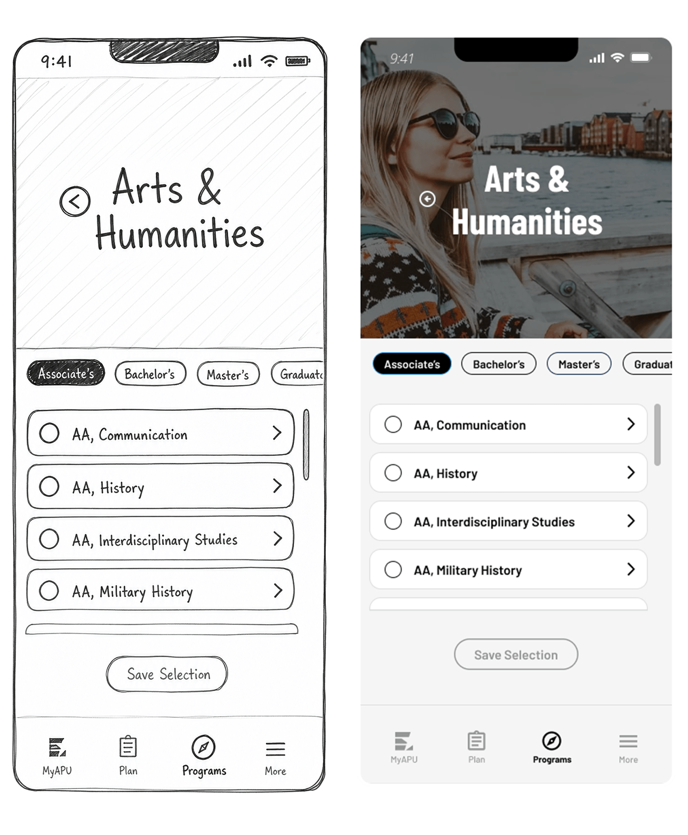
For prospective students, exploration wasn't about comparison, it was about possibility. Early concepts prioritized program discovery and cost comparison, which is what you build if you assume the user is evaluating options. Testing showed they responded far more strongly to experiences that helped them picture themselves succeeding.
The goal wasn't immediate conversion. It was helping students feel that college could realistically fit into their lives before asking them to commit to it.
For new students: turning onboarding into momentum
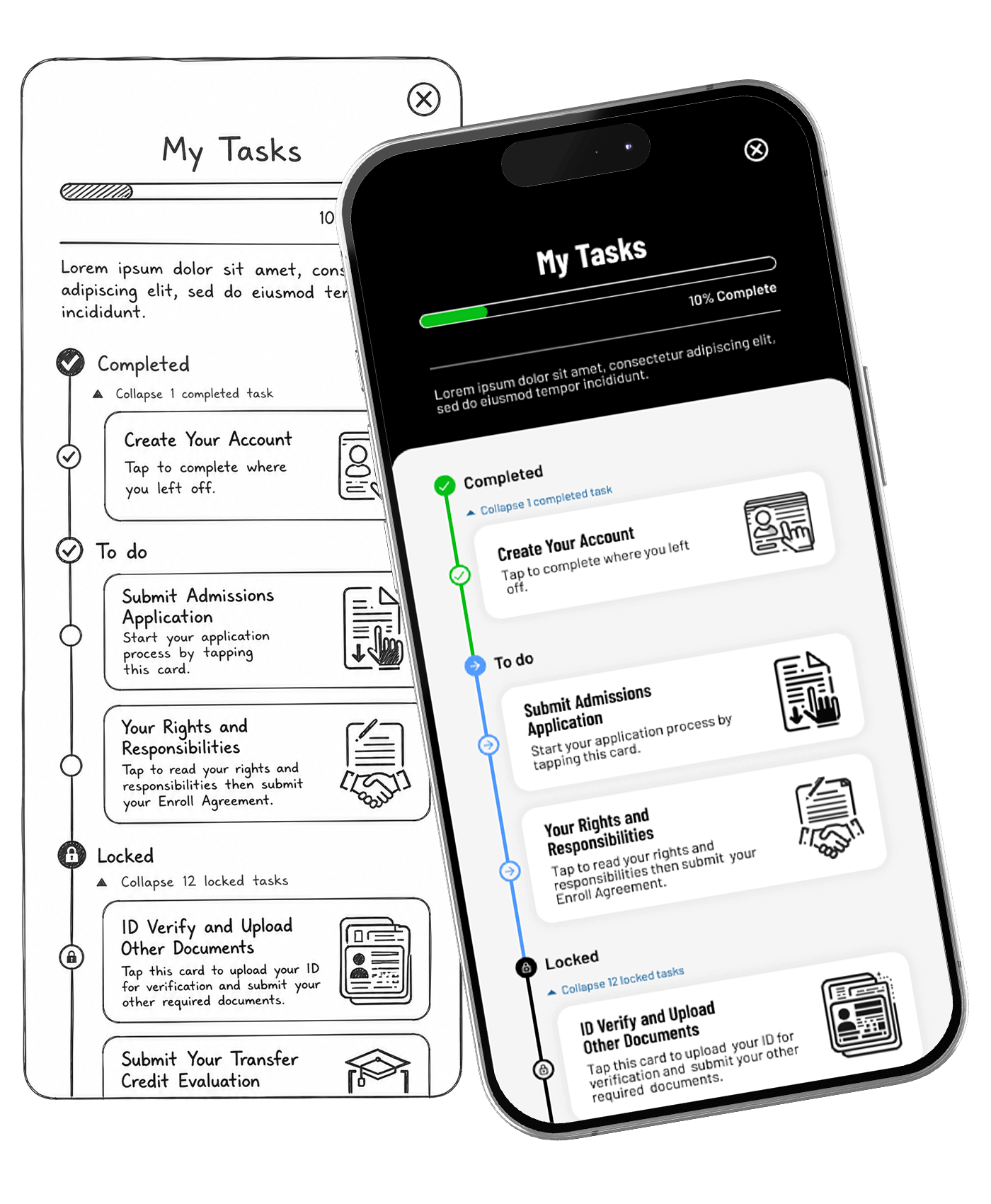
New students arrived motivated, and that motivation faded fast when the system felt unclear. The original onboarding surfaced every requirement at once, which created anxiety before a student had done anything. Three changes fixed the shape of it.
-
Progressive task disclosure. Requirements revealed step by step rather than all at once.
-
Visible progress indicators. Students always knew what was complete, what remained, and what came next.
-
Immediate confirmation states. Every completed step reinforced forward motion, reducing the need for manual support during the highest-risk retention window.
For active students: real life, not ideal schedules
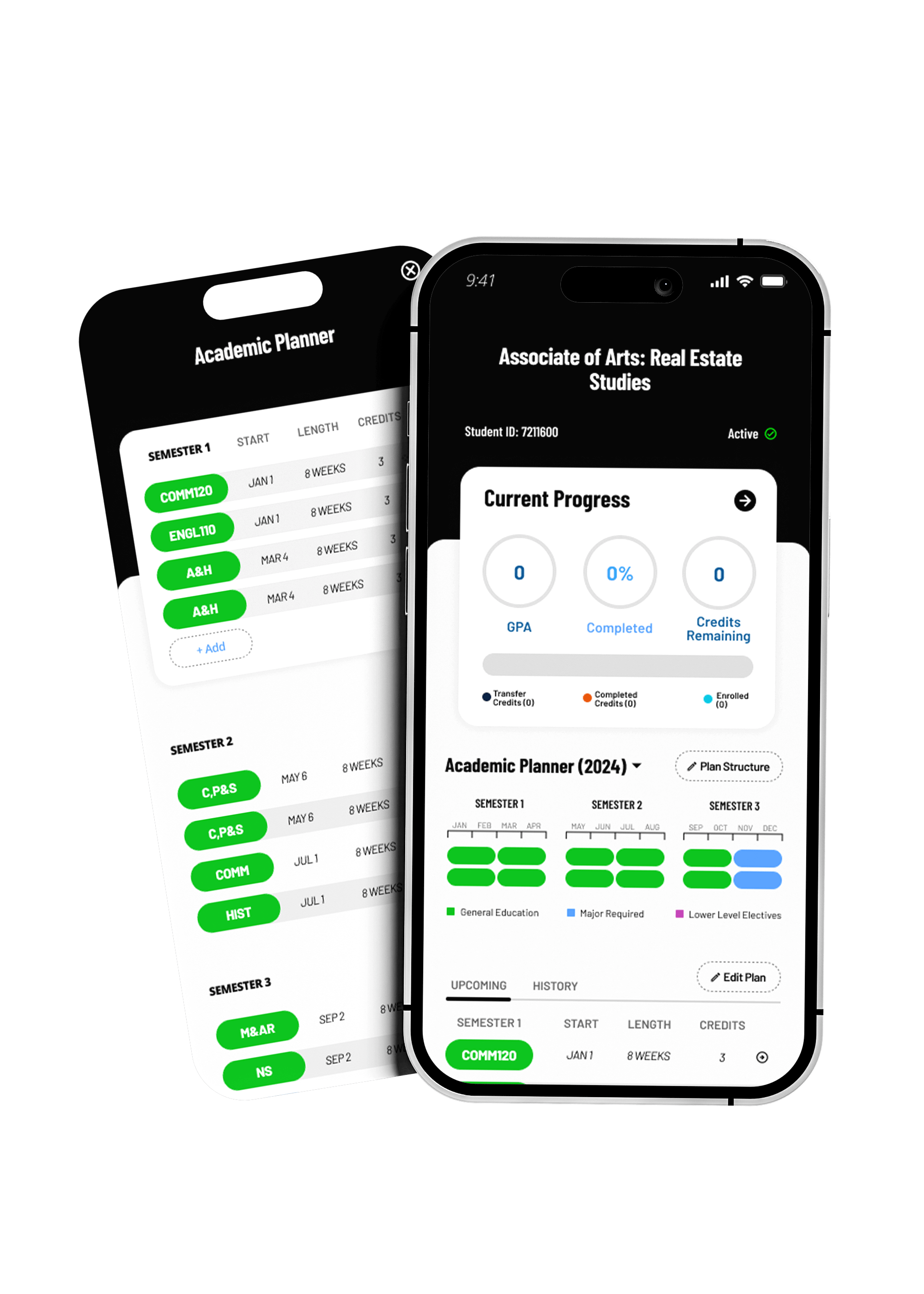
For active students every unnecessary step carried real cost. Many were doing coursework during work breaks, during deployments, or late at night after family responsibilities. The experience had to reduce cognitive overhead and let students decide confidently in short, interrupted sessions.
The product shifted from something students had to manage manually, to something that actively supported progress on their behalf.
The degree planner was the most complex feature, and the most instructive
The original vision was a fully customizable planning experience where students could build and sequence their own academic path. Midway through development, that direction changed significantly.
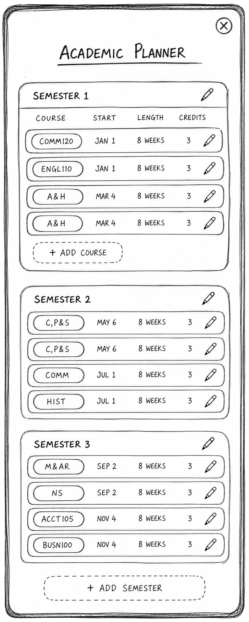
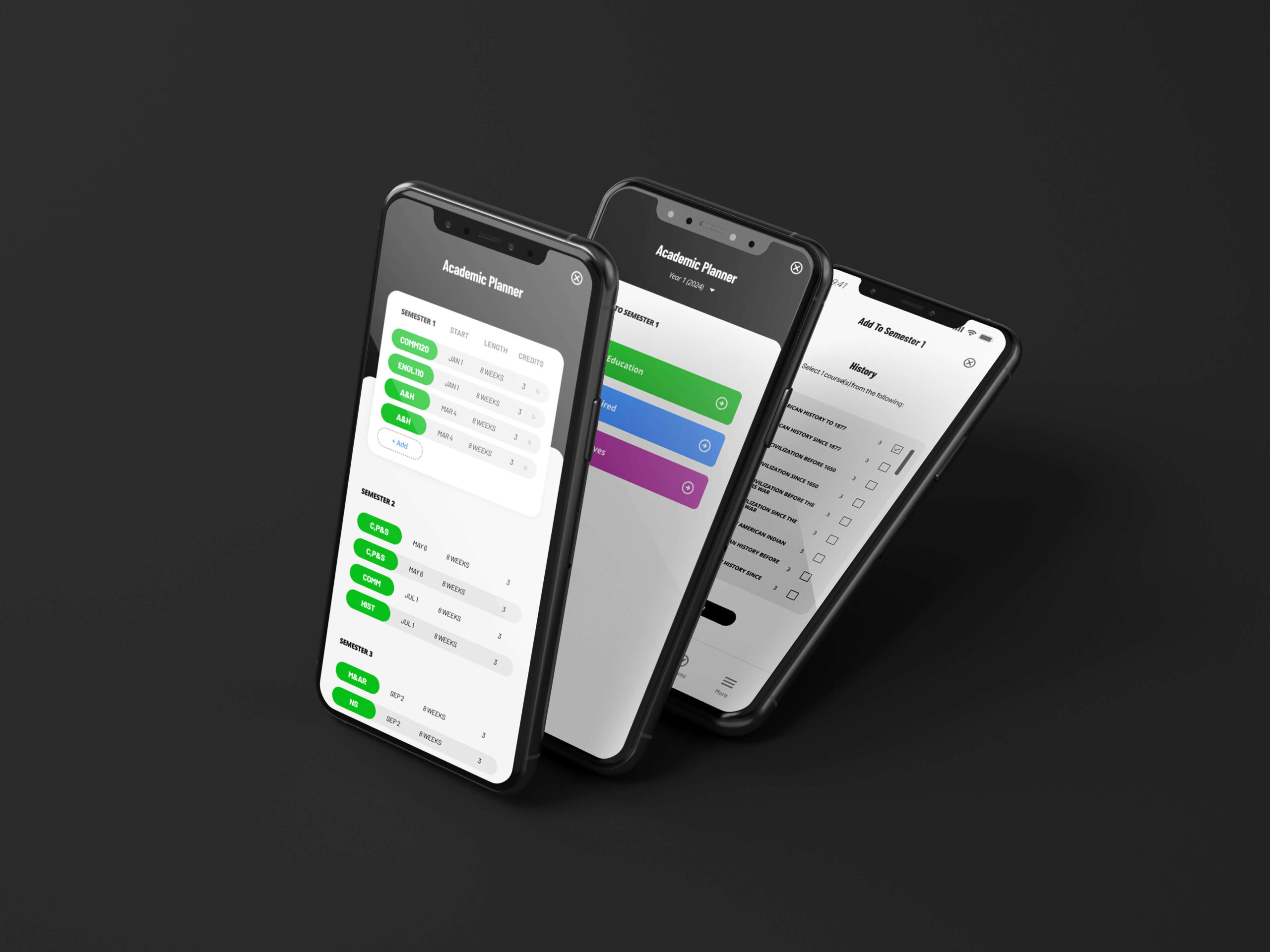
The customizable planner — courses added and re-sequenced by the student.
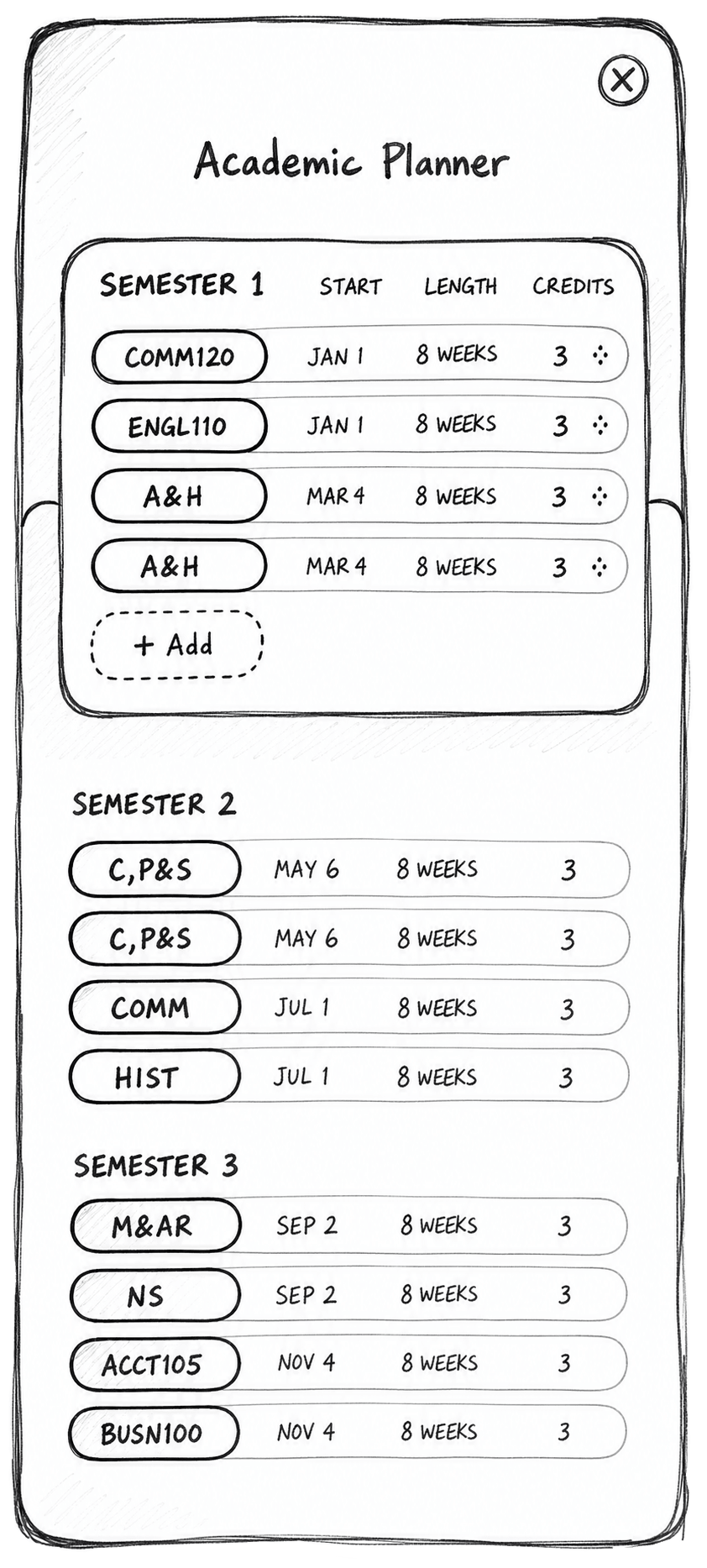
The generated sequence — a fixed term-by-term path, read-only by design.
A student-authored degree plan: build your own path, sequence it yourself, adjust it as circumstances change.
A read-only recommended sequence, as the academics team determined it had to be. That introduced a new set of design problems: how to generate the list, how to define priority logic, and how to handle error and dropout states gracefully.
The pivot cost time and created real rework. But the change itself wasn't the actual failure.
The issue was that the academics team hadn't fully aligned internally before engineering brought me in. I inherited a decision that wasn't final, and designed against it for weeks as though it were.
When multiple departments have authority over a feature area, don't assume alignment has happened upstream. Create the conditions to verify it early.
Delaying the most requested feature in the release
Late in development, stakeholders strongly advocated for integrated advisor chat. It tested positively at a surface level. Watching sessions more closely revealed a pattern nobody had asked about.
The more prominently chat appeared, the less students relied on self-service tools. They defaulted to asking for reassurance rather than building confidence in the system itself — which is precisely the outcome the whole product was built to produce.
Advisor chat in the initial release, prominently placed. Highly requested, and it tested well on first impression.
Delaying chat out of the initial release, despite executive pressure to include it. It shipped in a secondary release with more intentional placement, after self-service behaviors were already established.
A feature that feels helpful in the moment can undermine long-term user independence.
Executive pressure, a delayed feature, and a difficult conversation about why the thing everyone wanted wasn't going in.
Students built confidence in the self-service tools first, and advising outreach dropped by more than a quarter.
Outcomes
The redesigned experience improved both engagement and operational efficiency — the two things that usually trade against each other in a self-service product.
Increase in mobile app adoption, alongside stronger onboarding completion rates and repeat usage that didn't depend on notification prompts.
Decrease in outreach to academic advising among app users, with higher engagement on self-serve academic tools and fewer procedural support questions reaching advisors.
“I didn't think college would fit into my life; this app helped me realize it could.” APU student
That quote is the actual result. The metrics describe it from the outside: behind them were students completing onboarding without hesitation, planning schedules that fit real life, understanding degree progress without needing support, and moving forward without second-guessing every step.
Both figures come from production analytics rather than a controlled study, and the app launched into a population that previously had no comparable mobile option — so adoption growth measures a new channel filling, not a like-for-like improvement. The advising figure is the more meaningful of the two, since it compares app users against the same institution's baseline behavior.
What I carry forward
-
Verify alignment upstream.
When multiple departments have authority over a feature area, don't assume alignment has happened. The academics team hadn't settled the degree planner internally before engineering brought me in, and I inherited a decision that wasn't final. I now create the conditions to verify that before design work begins.
-
Design with adjacent populations, not just for them.
The app later became the foundation for MyAMU, a reskinned experience for American Military University students, whose constraints around deployments, connectivity, and high-stakes decisions under pressure are genuinely different. I would have recruited military students into usability testing earlier rather than assuming the core experience would fully translate.
-
Confidence is a design outcome, not a byproduct.
Task completion said the old systems worked. Students said they weren't sure the systems were for them. Measuring the second thing is what changed the product, and it's the measure I now ask for first.
MyAPU wasn't a redesign, it was a rethinking of what higher-education tools could feel like. Focusing on clarity, continuity, and reassurance turned fragmented academic systems into a trusted self-service experience — one that helped students keep moving at exactly the moments uncertainty used to stop them.